Cover Image

Good product card design helps a shopper decide whether an item is worth opening. Show a recognizable image, a descriptive name, a clear price, and the attributes that matter for that category. Then make the next action predictable. A shopper comparing office chairs needs different information from someone restocking coffee, even when both products appear in the same grid.
The difficult part is choosing what to leave out. A card has limited space, especially on a phone, but removing the wrong detail sends people into product pages just to discover that an item doesn't fit their needs. Adding every specification creates a different problem: nothing stands out.
Start with the shopper's decision, then build the layout around it. This guide explains how to choose card content, handle prices and stock, provide useful actions, build an accessible responsive grid, and test it with the catalog you actually sell.
Key Takeaways
- Keep product identity and price visible without hover, and add the category attributes needed for comparison.
- Match quick actions to the purchase: add a known item directly, but let shoppers choose required options first.
- Test long titles, unavailable variants, keyboard navigation, and slow image loading across the full grid.
What product card design must help shoppers decide
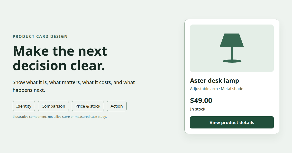
Illustrative card anatomy. Product and price are examples.
A card should answer four practical questions: What is this? Does it meet my needs? What will I pay? What happens if I select it? The answers need to be apparent enough that a shopper can compare adjacent products without memorizing details from separate pages.
In its research on product listing information, published in May 2023, Baymard distinguishes essential attributes from category-specific ones. Its usability testing observed shoppers guessing about missing attributes or visiting multiple product pages to find them. That supports providing relevant comparison information; it doesn't establish a universal conversion lift for any particular card layout.
Use that distinction when planning a component. Product name, thumbnail, and price provide a common foundation. Ratings and available variations can also help where the catalog supplies them. Category attributes explain the difference between otherwise similar options.
The following examples are planning suggestions, not findings from a test of these exact cards:
Product category | Details worth considering on the card | Likely next action |
|---|---|---|
Clothing | Color options, size range, material where it differentiates products | Choose size or view details |
Groceries | Pack size, unit price, relevant dietary information | Add a known item |
Furniture | Dimensions, material, number of pieces in a set | View details or compare |
Electronics | Model, capacity, key compatibility requirement | Compare or view details |
Replacement parts | Part number and compatible equipment | Check compatibility |
Choose the attributes by examining the task. Someone searching for a replacement charger needs to know whether it works with their device. A lifestyle photograph won't answer that question. Someone choosing a decorative vase might care about its shape first, followed by its height and material.
A useful planning exercise is to write down what would make a shopper reject each item. If a desk must fit a narrow alcove, width belongs in the comparison information. If a refill only works with one dispenser, compatibility deserves space. Move secondary details to the product page after those questions are covered.
Build a consistent hierarchy from real catalog data
Keep comparable information in comparable places. A shopper should be able to look across a row and locate names, prices, and key attributes without learning a new structure for every card. Consistency applies to the meaning of the content as well as its visual alignment.
NN/g's ecommerce product page guidance describes how inconsistent information makes product comparison difficult. Its research concerns product pages. Applying the same principle to listing cards is a practical design recommendation: display equivalent attributes for comparable items, using the same labels and units.
For example, showing the width of one shelf in centimeters and another in inches creates extra work. Showing dimensions on some furniture cards but only marketing labels on others prevents a useful comparison altogether. Fixing the catalog data may matter more than adjusting the font size.
Give the image a consistent job
Use the image to communicate what the item is and, where relevant, how it looks. Choose a consistent frame within a category so a small object doesn't appear larger than a neighboring product merely because its photograph is more tightly cropped.
Decide whether the image should contain the whole object or emphasize a detail. For a replacement part, an uncropped image can help people identify its shape. For clothing, a consistent model or garment presentation can make colors and cuts easier to compare. Use supporting product-page photographs to show what one thumbnail cannot explain.
A uniform image ratio keeps the grid orderly, but a uniform crop isn't always appropriate. Cropping a chair until its legs disappear removes information. Fit the whole product into the frame when its outline matters, and review the result with actual photographs rather than gray placeholders.
Write names that identify the product
A short brand name or model code can be meaningful to returning customers while telling a new shopper very little. Pair it with the product type when necessary: “Aster desk lamp” communicates more than “Aster.” Add capacity, pack quantity, or another distinguishing attribute when it separates nearly identical products.
Avoid cutting off the only part of a title that distinguishes two variants. “Cotton fitted sheet…” is a poor comparison label if the hidden words contain the mattress size. Move that detail into its own visible attribute instead of forcing everything into a long name.
Allow titles to wrap naturally before imposing a line limit. Test the longest real names and translations. If a clamp is necessary, make sure the visible text still identifies the product and that the full name remains available through the details link. A hover tooltip alone won't serve every touch or keyboard user.
Make secondary information quieter, not unreadable
Use spacing, weight, and grouping to distinguish product identity, price, and supporting details. Small, faint text can make a tidy mockup difficult to use. Review the card at its actual rendered size and at increased text zoom.
Ratings need context. If you display an average, also show the review count so shoppers can see the amount of feedback behind it. For an unrated item, display an honest empty state or omit the rating row. Don't substitute an invented score to preserve alignment.
Show price, variants, and availability honestly
Price should be visible without interaction and recognizable as the amount associated with the product shown. Keep the currency and number format consistent within the shopper's locale. Use a separate treatment for supporting information such as unit price or a subscription period.
For a discounted item, make the current price easy to distinguish from the previous price. A percentage badge alone doesn't tell someone what they will pay. If the card says “20% off,” the actual offer price still needs to be visible and agree with the details page.
When variants have different prices, explain the range. “From $29” is useful only if shoppers can understand that another selection may cost more. After they choose a variant, update the displayed price to that selection rather than leaving the cheapest price beside a more expensive item.
Separate product price from purchase conditions
A recurring purchase needs its billing period near the price. A pack needs its quantity. An item sold by weight needs the relevant unit. These are different offers, even when they share the same number.
Suppose two coffee cards both show $12. One contains a 250-gram bag and the other contains 500 grams. The headline price alone doesn't support a fair comparison. Show the pack size and, where useful, a consistently calculated unit price. These are illustrative amounts, not claims about a retailer's products.
Shipping information can belong at the list level or on individual cards. If every item has the same shipping policy, repeating the full message on every tile can crowd out more useful differences. If one item has a delivery restriction or a different fulfillment method, show that exception where shoppers evaluate it.
Don't claim a specific delivery date when the system needs a destination to calculate it. State the condition or let the shopper provide the missing information. A precise promise that changes later is harder to interpret than an honest conditional message.
Tie stock to the selected variant
Availability belongs to a purchasable variant, which can differ from the product family. A shirt might be available in blue but unavailable in black, or available in medium but not small. “In stock” on the parent product shouldn't imply that every option can be bought.
Update the image, price, availability message, and action together when a selection changes. If an option is unavailable, explain that state before the shopper submits an add-to-cart request. Keep enough context visible that they can try a different option without starting over.
The original idea of keeping stock near price is useful as a grouping choice, but there is no need to force both onto one line. On narrow cards, a separate availability row can be easier to read. An image badge can also work when it has adequate contrast and the state is available as text.
Use “Only 2 left” only when the inventory system provides that information for the relevant item. Don't invent a quantity or reset an urgency message when the page reloads. Plain “Out of stock” is better than a dramatic label that doesn't describe the actual state.
Decide how sold-out products belong in the list
Keeping every sold-out item visible isn't always the right choice. A temporarily unavailable product with an expected restock may still be useful to shoppers. A permanently discontinued product may deserve an alternative recommendation or removal from default results.
Make the decision with the catalog and shopper task in mind. You could offer an availability filter, place purchasable items first, or keep unavailable items visible with a clear label. Preserve list context when inventory changes so people don't lose their place during browsing.
If you offer restock notifications, describe that action explicitly. “Notify me” should lead to a notification flow. It shouldn't look like an enabled purchase button. Keep the details page reachable when it contains useful information about the unavailable product.
Choose actions that match the buying decision
A card's primary action should match what the shopper is ready to do. For an unfamiliar laptop, that usually means examining specifications and reviews. For a familiar grocery item with a known pack size, adding it directly can be a sensible shortcut.
A clothing card with required size and color options needs a selection step. Label it “Choose options” or provide clearly labeled selectors before enabling the purchase action. Automatically adding a default size can create an order the shopper never intended.
Quick view is another decision, not a mandatory feature. Baymard's research on quick views for specification-driven products describes the limitations of condensed overlays when shoppers need more information. A full details page can be more useful than a modal that hides specifications or starts another navigation path.
Keep navigation and actions distinguishable
Make it clear which area opens product details and which controls change a selection, save an item, or add it to the cart. If the card contains multiple actions, don't style every region as though it has the same destination.
A single prominent product link can connect the image and name. Separate buttons can handle wishlist or purchase actions. This lets people open the product in another tab using normal browser behavior while keeping local actions predictable.
Avoid labels that combine an unclear action with a price, such as a button containing only “$29.” Does it buy the item, open the page, or reveal an offer? Use words that describe the outcome. The price can remain immediately nearby.
Show the result of an action
After an add-to-cart request succeeds, confirm what was added, including the selected variant. Keep the feedback near the action and make it available to assistive technology. For example, a status message can identify the product and quantity without moving keyboard focus unexpectedly.
During a request, prevent duplicate submission and show progress. If the request fails, restore the action and provide a useful error. If inventory changed, explain the new availability and help the shopper choose an alternative.
Don't display a success message before the server confirms the operation. A visual animation can't substitute for a completed cart update. Test this flow with delayed and failed requests, not just the instant success state in a prototype.
Implement accessible product cards and a responsive grid
Use native HTML elements for their intended roles: links navigate, buttons perform actions, and text communicates prices and states. Start with a list of products and meaningful headings. Add richer interactions only after the basic structure works with a keyboard.
An entire card wrapped in a link is appropriate only when it contains no competing interactive controls. MDN's anchor element reference excludes interactive descendants from an anchor's permitted content. A wishlist button or variant selector therefore belongs outside that link.
Structure the card so its navigation and local actions remain separate. A product-details link opens the item; a save button changes its saved state. The application needs to implement the save behavior and its feedback.
Start with a product list. Each list item contains one product card.
Use one product-details link around the image and product name. Give the image a description that identifies the item.
Place comparison attributes, price, and availability after that link as readable text.
Keep the save button outside the product-details link. Give it a name that identifies the product, expose whether the item is saved, and provide feedback when the state changes.
Use a heading level that fits the surrounding page. If the product list sits inside a section with an H2, its product names can be H3s. The heading choice should follow the page structure, not the visual size of the card title.
Give icon-only controls an accessible name. A color selector also needs a readable color label and a visible selected state; color alone isn't enough to explain which option is active. For a toggle such as saving an item, keep its exposed state in sync with the actual saved state.
W3C's explanation of WCAG 2.2 target size describes a minimum of 24 by 24 CSS pixels at Level AA, with exceptions including sufficient spacing. That is a minimum criterion, not a recommendation to make every mobile control that small. Use larger targets when the layout allows, especially for closely grouped swatches and wishlist icons.
Let the grid respond to available space
CSS Grid can create columns based on the space in the container. The card's minimum useful width should come from its content, not from a desire to show the largest possible number of products.
.product-grid {
  display: grid;
  grid-template-columns:
    repeat(auto-fit, minmax(min(100%, 15rem), 1fr));
  gap: 1rem;
  padding: 0;
  list-style: none;
}

.product-card {
  display: flex;
  flex-direction: column;
  min-width: 0;
  padding: 1rem;
  border: 1px solid #cbd5e1;
  border-radius: 0.5rem;
}

.product-card__link {
  color: inherit;
  text-decoration: none;
}

.product-card__media {
  display: block;
  aspect-ratio: 1;
  overflow: hidden;
}

.product-card img {
  display: block;
  width: 100%;
  height: 100%;
  object-fit: contain;
}

.product-card h2 {
  overflow-wrap: anywhere;
}

.product-card button {
  margin-top: auto;
  min-height: 2.75rem;
}

.product-card :is(a, button):focus-visible {
  outline: 3px solid #1d4ed8;
  outline-offset: 3px;
}
The min(100%, 15rem) expression allows the column to fit a container narrower than the preferred minimum. auto-fit collapses unused tracks, so remaining cards can expand. auto-fill retains those empty tracks. MDN's repeat documentation explains the distinction; choose based on how sparse result sets should look.
This example uses flex layout inside each card, pushing the save button toward the bottom of a stretched row. It doesn't align every internal text row across every product. If exact alignment matters, consider shared grid tracks or subgrid after checking the browser support your project requires. Don't force equal content lengths by deleting useful information.
A two-column mobile grid is an option to test, not a universal rule. Some categories need wider cards to expose dimensions or specifications. Compare a wider list with a denser grid using the same products and tasks. Extra visible tiles aren't useful if their key differences are unreadable.
Reserve image space and load the right file
Set image dimensions that match the source ratio so the browser can reserve space before the file loads. web.dev's guidance on layout shifts explains how intrinsic dimensions help prevent content from moving during image loading.
Provide image sizes appropriate to their rendered width rather than sending a full-resolution product photograph to every small thumbnail. Responsive sources can let the browser choose a suitable file. Keep the crop or ratio consistent when supplying different resolutions of the same view.
Lazy-load images farther down a long list when appropriate, but don't automatically lazy-load the main image visible on initial load. MDN's image reference covers loading behavior and image attributes. Review performance on a constrained connection, where delayed images and shifting card content become obvious.
Test the full product list, then measure useful outcomes
A card that looks balanced in isolation can fail beside real products. Build a test set with long titles, short titles, missing ratings, multiple currencies where supported, sale prices, unavailable variants, and photographs with different proportions. Include narrow screens and enlarged text.
Give participants tasks that require comparison. Ask them to find a shelf that fits a stated width, choose a refill compatible with a dispenser, or identify a shirt available in their size. Use realistic constraints instead of asking which mockup looks nicer.
Watch where they need information that the card doesn't provide. Repeated trips into product pages may reveal a missing attribute, but opening details isn't inherently a failure. A shopper should visit the details page to investigate a promising product, not merely to eliminate an obviously unsuitable one.
A practical review checklist can guide the first pass:
Can someone identify each item and compare its current price without interaction?
Are the attributes relevant to this category present across comparable products?
Do image, price, stock, and selected options describe the same variant?
Can keyboard users reach every action and see where focus is?
Are control names and feedback meaningful with a screen reader?
Do long names and increased text size remain readable without clipping?
Does returning from details preserve filters, sort order, and browsing position?
Do delayed requests, broken images, and stock changes produce understandable states?
After fixing usability problems, evaluate changes with metrics tied to the intended task. Track product-list visits, details opens, completed additions, variant corrections, and purchase outcomes where the system permits. Segment by category and device so one group's behavior doesn't hide another's difficulty.
A higher card click rate alone doesn't prove a better design. It might mean shoppers are interested, or it might mean they must open every product to find the missing size. A lower click rate could mean people reject unsuitable items earlier. Pair the numbers with observed tasks and downstream outcomes.
For an experiment, define the hypothesis before changing the component. For example: displaying shelf width on listing cards should help shoppers identify suitable shelves with fewer unnecessary details visits. Keep the other major variables stable, define the evaluation period, and record the limits of the sample. Don't promise a percentage improvement without measured evidence.
The most useful first change is usually concrete. Add the missing pack quantity, clarify a sale price, expose an unavailable size, or separate a save button from the details link. Then test the full list again. Good product card design gives shoppers enough information to choose their next step with confidence, and lets the details page handle the questions that genuinely need more room.
Linh Nguyen
Graphic Designer
Passionate Graphic Designer | Specializing in Illustration Design | Bringing Captivating Visuals to Life