Cover Image
You have 1,500 fonts on Google Fonts. Most designers pick Inter. That's not a knock — it's a symptom of a real problem: when everything is possible, decision-making gets paralyzing.
The trap is thinking the problem is "which font should I use." It's not. The real question is: how do two typefaces relate to each other? Get that relationship right, and you can pair almost anything. Get it wrong, and even the most celebrated fonts produce a layout that feels flat, confused, or just boring.
This post gives you the framework for that relationship — not a list of fonts to copy, but the decision logic that works for any minimalist project in 2026.
Why Most Minimalist Font Pairings Fail — And How to Fix Them
The most common minimalist pairing mistake isn't picking a bad font. It's picking two fonts that look different but produce no hierarchy.
Helvetica Neue and Arial is the canonical example. On screen, they're nearly indistinguishable — different fonts, identical visual effect. Designers reach for this combination because they're trying to be "safe," but what they're actually doing is eliminating tension without creating harmony. You end up with no visual hierarchy at all.
The fix is the contrast-over-match principle: choose fonts that differ in at least two properties but share one. They might differ in weight and style (serif vs. sans-serif) while sharing the same x-height. Or differ in classification while sharing the same geometric character. The shared property is what makes them feel like they belong in the same design. The contrast is what creates hierarchy.
A bad pairing looks different in theory but looks the same on screen. A good pairing looks different and creates tension — and that tension is what makes a minimalist layout interesting rather than inert.
The single most practical test: if you can replace one font with Comic Sans and the layout would still feel "fine," you don't have enough contrast. The goal is that removing one typeface should feel like a real loss.
The Single vs. Mixed Font Decision — Which Approach Serves Your Design
There are two valid paths in minimalist typography, and most designers default to one of them without knowing why.
Path 1: Single variable font family. Use one typeface — usually Inter, DM Sans, or Geist — across all weights and sizes. One family, multiple weights. This is the performance-first choice: one font file, one HTTP request, consistent character set, maximum coherence. It's the default for most tech companies, SaaS products, and anything performance-sensitive.
The problem with this path is personality. A single-family system with Inter Regular + Inter Bold is clean, legible, and entirely forgettable. It doesn't communicate anything about the brand beyond "we made a functional choice." This is fine for B2B SaaS. It's a problem for anything that needs to feel distinctive.
Path 2: Mixed pairing. One font for headings (often a serif or display face), one for body (clean sans-serif). This creates visual drama — the contrast between the two typefaces carries the personality of the design. It's the editorial approach: Think magazine layouts, independent brand sites, portfolios.
The cost is complexity. Two font families means two loading strategies, more CSS to maintain, and a risk that the two faces feel mismatched rather than complementary. Most designers avoid this path not because it's wrong, but because they don't have a framework for making it work.
The actual rule: use single-family when your design needs to disappear (B2B tools, dashboards, utility-first products). Use mixed pairing when your design needs to express something (editorial, portfolio, consumer brand, creative work). The decision is about communication goal, not preference.
If you're not sure which path serves your project, ask: does this design need to feel like us, or does it need to feel like nothing? The answer tells you which path to take.
The 4 Pairing Frameworks That Work in Minimalist Design
Once you've chosen single vs. mixed, these are the four structural approaches that produce real hierarchy in minimalist design:
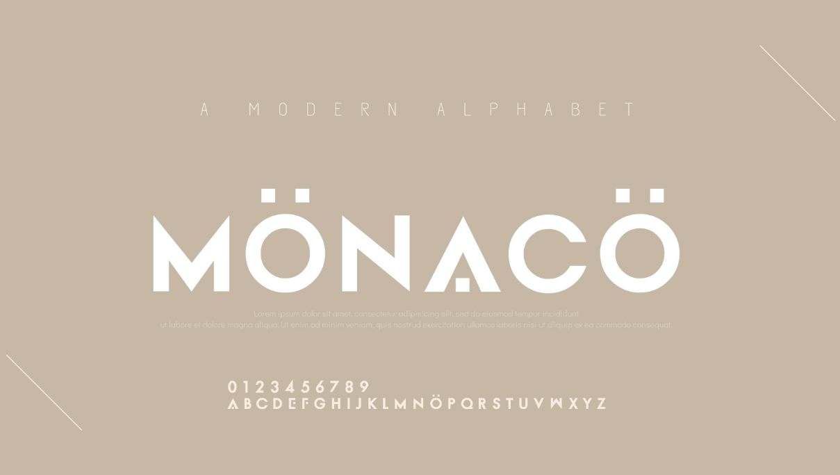
Framework 1 — Serif + Sans-Serif. The classic pairing. A serif display font (Playfair Display, DM Serif Display, Cormorant) carries the heading hierarchy; a clean sans-serif (Inter, DM Sans, Source Sans 3) carries body text. The contrast is sharp, the hierarchy is immediate, and it works for editorial content, portfolios, and brand sites. The risk: if the serif is too decorative, it starts fighting the minimal aesthetic. Keep the serif restrained — light or regular weight, not display-heavy.
Framework 2 — Mono + Sans-Serif. A monospace font paired with a clean sans-serif. The monospace face brings precision and technical character to headings; the sans-serif handles the readable body. This is the developer-designer pairing — it communicates craft without relying on decoration. Works especially well for technical blogs, dev tools, and anything where the audience appreciates technical specificity. Geist Mono is the leading choice in this category in 2026, available via Fontsource for self-hosting.
Framework 3 — Display + Geometric Sans. A bold display font (Bebas Neue, Clash Display, Monument Extended) as the hero typeface, paired with a clean geometric sans for body. This is the loudest of the four frameworks — it's the choice for brands that want to make a statement. High visual impact, lower legibility in body text, which is fine for short-form content. Less appropriate for body-heavy editorial sites.
Framework 4 — Single Family Variable. One variable font family used across its full weight range (100–900). You get the consistency of a single typeface with the variety of a full type system — light headings, regular body, bold subheadings. The performance advantage is real (one file, one request) and the aesthetic is clean and coherent. The limitation is personality: you can only vary weight, not style, so the visual range is narrower than a mixed pairing.
💡 Tip: If you're unsure which framework to start with, default to Framework 1 (Serif + Sans) for editorial/generative content and Framework 4 (Single Variable) for utility-first products. These are the most broadly applicable starting points.
The Fonts to Start With — 2026 Minimalist Defaults
These aren't the "best" fonts in the abstract — they're the fonts that have earned their position through broad browser support, excellent variable font options, and proven versatility across minimalist applications:
Inter — The default choice. Open-source, actively maintained, massive weight range (100–900), excellent legibility at all sizes. Use for both headings and body in a single-family system, or as the sans-serif leg in a serif+sans pairing. The reason it wins isn't charm — it's dependability.
DM Sans — The warmer alternative to Inter. Same variable font structure, slightly friendlier character. Excellent when you want the reliability of Inter but with slightly more personality. Works as both body font and a heading font at heavier weights.
Geist — The developer-designed option. Sharp, modern, excellent monospace variant that pairs perfectly with its own sans-serif. Best for tech products, dev tools, and anything where the audience appreciates precision and craft.
Space Grotesk — A geometric sans with personality. The rounded terminals give it warmth that standard geometric fonts lack. Works well as a heading font paired with Inter for body text.
Plus Jakarta Sans — The newer option on the list. Geometric but soft, with excellent weight variety. Strong choice for modern product sites that want personality without eccentricity.
When evaluating any of these as a body font, test at 14px and 16px. Minimalist fonts that look elegant at 24px often become hard to read at 14px — the details that make them distinctive at display sizes get lost at small sizes. The best body fonts are the ones that look cleanest at their smallest intended size, not the ones that look most interesting at their largest.
Implementing Your Font System in CSS — From Import to Custom Properties
A pairing framework only survives implementation if it's coded to be maintainable. The right structure means a new designer can understand your type system in thirty seconds — and a developer can update a font weight without a review.
The foundation is CSS custom properties:
/* Font families */
:root {
  --font-heading: 'DM Serif Display', Georgia, serif;
  --font-body: 'DM Sans', system-ui, sans-serif;

  /* Type scale — Perfect Fourth from 16px base */
  --text-xs:   0.75rem;   /* 12px */
  --text-sm:   0.875rem;  /* 14px */
  --text-base: 1rem;      /* 16px */
  --text-lg:   1.125rem;  /* 18px */
  --text-xl:   1.5rem;    /* 24px */
  --text-2xl:  2rem;      /* 32px */
  --text-3xl:  2.67rem;   /* 43px */

  /* Line heights */
  --leading-body: 1.6;
  --leading-heading: 1.15;

  /* Measure */
  --measure: 65ch;
}
Load your fonts efficiently. Using Google Fonts via works but adds DNS lookups and render-blocking time. The modern standard is self-hosting via Fontsource:
npm install @fontsource/dm-sans @fontsource/dm-serif-display
/* In your base CSS */
@import '@fontsource/dm-sans/400.css';
@import '@fontsource/dm-sans/600.css';
@import '@fontsource/dm-serif-display/400.css';

:root {
  --font-heading: 'DM Serif Display', Georgia, serif;
  --font-body: 'DM Sans', system-ui, sans-serif;
}
Self-hosting eliminates third-party latency and gives you full control over which weights to load (loading 400, 600, and 700 only is better than loading the full 100–900 range when you only use three).
For font loading performance, always set font-display: swap — this tells the browser to use a system fallback font until your custom font loads, preventing invisible text (FOIT). Google Fonts sets this by default; self-hosted fonts need it explicitly:
@font-face {
  font-family: 'DM Sans';
  src: url('/fonts/dm-sans.woff2') format('woff2');
  font-display: swap;
  font-weight: 400;
}
The last step is the one most designers skip: testing at 375px. Your font pairing was designed on a 1440px canvas. At 375px, the body font shrinks to around 16px equivalent, and the contrast that looked dramatic at desktop can blur. Test every combination in a mobile viewport before you call the type system done.
Minimalist Font Checklist — 6 Checks Before You Ship
Before you call a minimalist type system complete:
1. Fonts tested at 375px. Open your layout at mobile width. Can you read the body text without squinting? Does the heading still carry visual weight at small sizes? This is where most minimalist type systems quietly fail — desktop looks refined, mobile looks cramped.
2. Contrast ratio ≥ 4.5:1 on body text. WCAG 2.2 enforces 4.5:1 for all body text. Use the WebAIM Contrast Checker on every text/background combination in your type system. Light-on-white minimalist pairings often pass at large sizes but fail at 14–16px body. Test at the smallest size you'll actually use.
3. Maximum 2 font families or 1 variable font family. A minimalist layout with three font families is no longer minimalist — it's just a lot of fonts. If you have two font files loading, that's the ceiling. One is the target.
4. font-display: swap set on all custom fonts. FOIT (flash of invisible text) is the default behavior when a custom font takes time to load. swap shows system fallback text immediately and swaps when your font loads. It's a one-line CSS fix that makes your type system resilient on slow connections.
5. Heading and body fonts have real visual contrast. Look at your layout with the text replaced by gray blocks. Can you still tell where the headings are? If yes, the size difference alone is carrying the hierarchy — that's fine. If the heading vs. body distinction disappears without text, your fonts need more contrast, not just more size difference.
6. No more than 3 font weights used per page. In minimalist design, restraint is a feature. If you're loading Regular, Medium, SemiBold, Bold, and ExtraBold of the same font, you've created a weight spectrum instead of a hierarchy. Three weights max: one for body, one for subheadings, one for display.
The real test of a minimalist type system is whether it works when the chips are down — at mobile sizes, on a slow connection, with a user who has bumped their browser font size to 125%. If it still holds at 375px with font-display: swap doing its job and a WCAG 4.5:1 ratio on the body text, you're done. If not, go back to the framework and pick a different pairing approach.
Pick deliberately. Implement systematically. Test without mercy.
Author