Cover Image
You've read the listicles. "10 UI Design Principles You Need to Know." They list Jakob Nielsen's 10 usability heuristics -- visibility of system status, consistency, error prevention -- all valid, all correct. And somehow, after reading them, you still don't know how to fix the interface you're staring at right now.
That's because those principles are taught in isolation. The real world of UI design doesn't hand you isolated problems. It hands you a screen where spacing is inconsistent, typography feels off, nothing has weight, and you can't explain why the whole thing looks wrong even though every individual element looks fine.
The answer is that those elements aren't working as a system. This post is about building that system.
Why Most UI Design Advice Falls Flat
Here's the pattern: an article introduces a principle, shows a before/after screenshot, and moves on. You apply it to one element. Your interface gets slightly better. You apply it to the next. Nothing changes. The elements look the same but somehow still don't cohere.
The problem is that UI design principles are not independent variables. Visual hierarchy doesn't work if your typography is broken. Spacing doesn't create rhythm if your type scale is wrong. Depth looks fake if your shadows don't respect a light source. Every principle touches every other principle.
The goal isn't to apply principles -- it's to build a system where each principle reinforces the others.
The Visual Hierarchy Blueprint
Visual hierarchy is the most discussed principle in UI design and the least understood in practice. Most designers know they need it. Fewer know how to build it as a system.
The four tools of visual hierarchy work together as a pipeline:
Size creates immediate attention. The largest element on the screen commands focus first. But size alone creates a monotone -- everything big looks equally important.
Weight (font weight, border weight, shadow intensity) adds a second dimension. You can have a small element that demands attention through bold weight sitting next to a larger but lighter element that recedes. This interplay is where real hierarchy lives.
Contrast is the multiplier. The greater the contrast between two elements, the more clearly their relationship is communicated. Low contrast between a heading and body copy means the reader has to work to find the hierarchy. High contrast means it communicates instantly.
Spacing is what most designers get wrong. They treat spacing as decoration -- breathing room between things. But spacing is structural. It communicates relationships. Elements close together are related. Elements far apart are separate. A headline that sits close to its paragraph body and far from the next section tells the reader exactly where one idea ends and another begins.
The mistake is using one of these in isolation. Build all four into every section and the hierarchy takes care of itself.
Typography as Architecture
Typography in UI is not about choosing a beautiful font. It's about building a structure that guides the reader's eye through content in the right order.
Type scale is the foundation. A well-designed scale uses a consistent ratio -- 1.25 (Major Third), 1.333 (Perfect Fourth), or 1.414 (√2) -- to generate heading sizes from a base body size. This creates visual harmony because all the sizes are mathematically related.
Without a scale, you get arbitrary font sizes that feel wrong even when you can't explain why. With a scale, even an unfamiliar design feels coherent.
Line height is where most UIs fall apart. Body copy needs 1.4 to 1.6 times the font size for comfortable reading. Headings need less -- 1.1 to 1.3 -- because they sit above a visual break. If your body text has the same line height as your headings, everything runs together and the page feels dense and unreadable.
Line length is a constraint that sounds obvious but gets violated constantly. The ideal line length for body text is 60 to 75 characters. Longer lines exhaust the eye at the end of each line. Shorter lines break reading rhythm. On mobile, this means single-column layouts are almost always correct. On desktop, it means a maximum content width of around 680px -- not the full browser width.
The practical test: open your design at a reading distance and squint. Can you immediately see the structure? If the page is a grey block, your type scale and line height need work.
Spacing Systems That Create Rhythm
A spacing system is a set of named values used consistently throughout an interface. Instead of using random pixel values (8px, 13px, 22px, 47px), you define a scale (4, 8, 16, 24, 32, 48, 64, 96) and use only those values.
This sounds like a productivity constraint, but it's actually a visual tool. When elements share the same spacing values, the interface develops rhythm. The eye learns the spacing language and can predict where elements will sit. This is a form of consistency that users feel but never consciously notice.
Rhythm specifically comes from repeating spacing relationships. If your card padding is 24px, your card gap should probably be 24px. If your section padding is 48px, your between-section spacing should be 48px or a multiple of it. This repetition creates a visual heartbeat.
Start with whitespace. Before adding any element, give the layout generous empty space. Then fill that space with structure. If you start cramped and try to add breathing room later, you'll spend hours redistributing and still end up with an interface that feels tight.
The practical rule: design with 8px grid increments. 4px for tight internal spacing (icon to label, letter spacing), 8px for component-level spacing (padding inside a button), 16px for element-level spacing (between form fields), 24px for section-level spacing (between a label and its content area), 48px or 64px for major section breaks. Stay on the grid and your spacing will feel right before you even check it.
Depth and Layering: Shadows, Overlap, and Elevation
Flat design made designers afraid of depth. For years, the response to flat interfaces was more flatness -- removing all shadows, all gradients, all sense of layering. The result was interfaces that felt lifeless and where everything sat on the same plane with no sense of what was above what.
Depth in UI is not decorative. It communicates state and relationship.
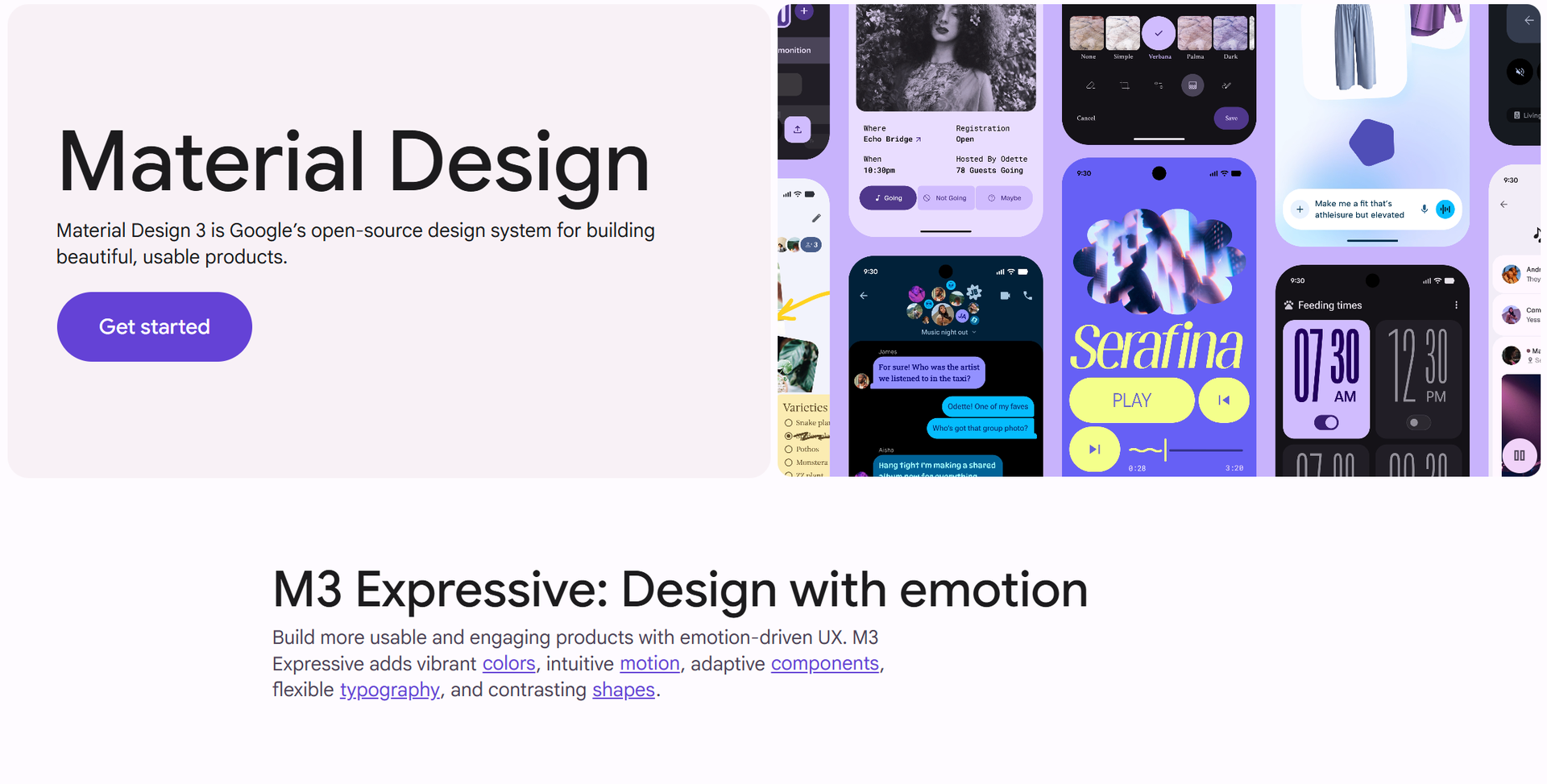
Elevation is the primary tool. Material Design formalised this with a shadow scale -- elevation 0 for flat surfaces, elevation 1 for cards at rest, elevation 2 for raised buttons, elevation 8 for dialogs, elevation 24 for modals. Each elevation level has a specific shadow profile. This isn't just aesthetic -- it communicates what's on top of what.
A dropdown menu that appears at elevation 4 above a card at elevation 1 is immediately understood as sitting above the card. A tooltip at elevation 8 above a dialog at elevation 8 creates ambiguity about which is on top. The shadow communicates the layering.
Overlap is underused. Most designers space elements apart rather than letting them overlap. But strategic overlap -- an image slightly overhanging a card edge, a label sitting partially over a photo, a badge overlapping a button corner -- creates a sense of depth and physicality that pure spacing cannot achieve.
The rules: if you use shadows, define a consistent light source direction (almost always from above) and keep shadow softness and spread proportional to elevation. Don't mix shadow styles within the same interface. And when overlapping elements, maintain clear visual boundaries -- overlap should clarify relationships, not create visual confusion.
Consistency That Users Feel But Never Notice
This is the paradox of good consistency: when it's done right, users don't notice it. They just feel comfortable navigating your interface. When it's broken, they feel lost and can't explain why.
Consistency operates at three levels.
Visual consistency is what most designers focus on -- the same colors, the same typography, the same spacing values, the same component styles throughout. This is the minimum. It means a button in one part of the interface looks and behaves like a button in another part.
Functional consistency goes further. It means the same interaction patterns produce the same results. If clicking a primary action in one screen opens a confirmation dialog, clicking a primary action in another screen should not silently submit. If sorting a table by a column is a one-click operation in one place, it shouldn't require a dropdown menu elsewhere.
Structural consistency is the most subtle. It means the layout follows the same logic everywhere. If navigation sits in a left sidebar on one page, it shouldn't jump to a top navigation bar on another. If forms use a two-column layout in one section, they shouldn't switch to a single-column layout in another without good reason.
Users build a mental model of how your interface works. Every inconsistency breaks that model. The cost isn't immediate -- users adapt. But the adaptation is cognitive load, and cognitive load accumulates into frustration.
The Cognitive Load Test
Cognitive load is the mental effort required to use an interface. Every decision a user has to make, every pattern they have to learn, every element they have to parse -- all of it adds to the load.
High cognitive load doesn't just make interfaces hard to use. It makes them feel hostile. Users blame themselves -- "I'm not smart enough for this" -- when the interface is actually poorly designed.
The test is simple: can someone use this interface without thinking?
Not "can they figure it out eventually." Not "can they use it after reading the documentation." Can they use it without thinking. The moment a user has to stop and deliberate -- "should I click this or that?" -- you've lost.
Reduce choices wherever possible. If most users will choose one option, make it the default. If an action is destructive, require confirmation -- but if it's routine, remove every unnecessary gate. Show only what's relevant to the current action. Hide complexity behind progressive disclosure -- show the basics first, let users drill down when they want more.
The aesthetic-usability effect means that beautiful interfaces feel easier to use. This isn't magic -- it's that good visual design reduces cognitive load by communicating clearly and reducing visual noise. Whitespace isn't wasted space. It's load reduction.
The principles in this post are not new. Most have been articulated in one form or another for decades -- Nielsen's usability heuristics date to 1994. What's changed is our understanding of how they interact. The interface that works isn't the one with the most impressive individual elements. It's the one where every element plays its role in a coherent system, where hierarchy, typography, spacing, depth, and consistency all reinforce each other.
Build the system, not the checklist.
Author
Linh Nguyen
Graphic Designer
Passionate Graphic Designer | Specializing in Illustration Design | Bringing Captivating Visuals to Life