Cover Image
You open Dribbble. You open Mobbin. You open three Figma community files. Forty-five minutes later, you have thirty screenshots and no decision. Every reference looks good. None of them tell you why a pattern works or whether it will survive the handoff to code.
This is the gap most "best pattern library" roundups miss. They list tools. They do not tell you what each one is actually for, when to use it, or how to keep it from becoming a folder of abandoned screenshots.
I am a graphic designer. I have built and broken multiple pattern libraries. Here is what actually matters in 2026.
The Pattern Library Spectrum: Reference Galleries vs Component Kits vs Full Design Systems
Before anyone hands you a list of URLs, you need to know what you are shopping for. In 2026, "pattern library" means three very different things, and mistaking one for another is the fastest way to waste a sprint.
Reference galleries are the first tier. These are screenshot libraries — curated collections of real, shipped interfaces organised by pattern type. Mobbin, Pttrns, Screenlane. They answer the question "what does a good checkout flow look like in 2026?" with visual evidence, not opinions. They do not give you code, components, or tokens. They give you visual research superpowers. Every designer should have at least one in their toolkit, and I will cover the top contenders in the next section.
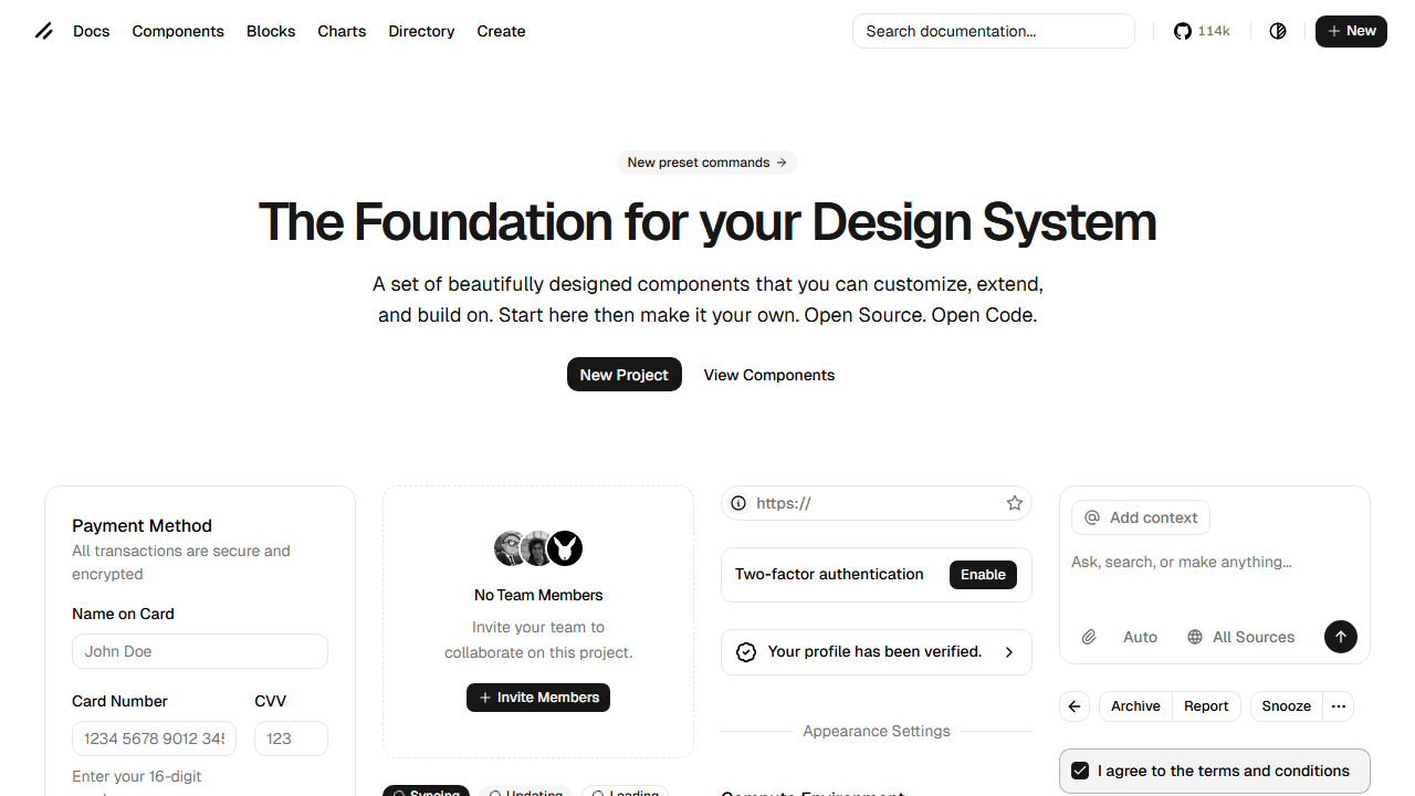
Component kits are the second tier. These are coded UI building blocks — buttons, modals, inputs, cards — that live in your codebase, not just your Figma file. shadcn/ui dominates this category in 2026, alongside newer entrants like ReUI with its 966+ free patterns. The key difference from five years ago: component kits now ship as copy-paste source code, not npm packages. You own the implementation. You can modify every line. No black-box dependency.
Full design systems are the third tier. Material Design, Ant Design, Carbon — these are complete operating systems for UI. They include components, patterns, documentation, tokens, and governance. They are powerful and heavy. Unless your team is 50+ people or your product is enterprise-scale, a full design system is probably overkill in 2026. You need patterns, not a bureaucracy.
💡 Tip: Most designers need a reference gallery for research plus a lightweight component kit for implementation. Start there. Add a full design system only when the coordination cost of not having one exceeds the maintenance cost of having one.
The distinction matters because the 2026 landscape has blurred the lines. Tools like Mobbin now feed AI agents directly. Component kits like shadcn/ui now define the visual language of AI-generated code. Understanding which tier solves your actual problem is half the battle. And that problem almost always starts with visual research.
The Designer's Reference Stack: Mobbin, Pttrns, Screenlane, and the Visual Research Toolkit
When I start a new project, I do not open Figma. I open Mobbin.
This is not a paid endorsement. It is a workflow that has saved me more hours than any Figma plugin. Here is how the top reference galleries compare for actual design work in 2026:
Tool | Content | Best For | Standout Feature |
|---|---|---|---|
621,500+ screens, 142,200+ user flows | Competitive analysis, UX patterns | Comprehensive flow recordings of real products | |
Mobile, iPad, Apple Watch patterns | Mobile-specific pattern research | Filter by OS or pattern type | |
Latest web + mobile screens | Visual trends, interaction inspiration | Updated frequently with recent releases | |
Step-by-step flow recordings | Understanding multi-step interactions | Video recordings of real product flows | |
Best-practice checklists | Pattern validation | Pre-shipping sanity checks for common patterns |
Mobbin is the heavyweight. Its library covers fintech, e-commerce, health, productivity, social, and SaaS. When I need to know how five different apps handle multi-step onboarding with form validation, Mobbin gives me the actual screens — not mockups, not redesign concepts, shipped product. The flow recordings are what make it irreplaceable: you see how patterns behave across screens, not just how they look in isolation.
Pttrns is narrower but faster. If I need mobile-specific patterns for a list view, a search interface, or a filter system, Pttrns surfaces them in seconds. The OS-level filtering (iOS vs iPad vs Apple Watch) is genuinely useful when you are designing for a specific platform and need to respect platform conventions.
Screenlane is my discovery engine. It is updated more frequently than Mobbin, so it catches design trends before they appear in competitive analysis roundups. If I want to see how the spatial depth and liquid glass aesthetics are actually shipping in 2026, Screenlane is where I look first.
🚀 Pro tip: Do not use these tools as inspiration folders. Use them as answer keys. Before designing any pattern, find three shipped examples across different industries. Ask: what is the same across all three? That is the convention — follow it. What is different? That is the brand expression — make it yours.
The value of a reference library is not the screenshots. It is the pattern recognition you build by consuming them systematically. But in 2026, there is a new dimension to this workflow that did not exist a year ago. Those same reference galleries are starting to feed AI coding agents directly. More on that in the section on Mobbin MCP.
But before we get to AI, we need to talk about the component kit that rewired how designers and developers share patterns.
From Copy-Paste to AI-Ready: How shadcn/ui and ReUI Rewired the Pattern Library Model
If you have opened any AI coding tool in 2026 — Cursor, Claude Code, v0, Bolt, Lovable — you have seen shadcn/ui components. It is the default design language of AI-generated interfaces. And the reason it won is not because it is prettier than MUI or more complete than Ant Design. It won because of how it is distributed.
The old model: npm install component-library. You get a black box. Theming is a configuration file. Customization means fighting someone else's CSS specificity. When the library ships a breaking change, your entire UI updates whether you want it to or not.
The shadcn/ui model: you run npx shadcn-ui@latest add button and it copies the source code into your project. You own components/ui/button.tsx. You can change every line. There is no dependency to break, no theme object to override, no abstraction to fight. As one developer put it on Hacker News, shadcn/ui "convinced me that there is a lot of utility in Tailwind" — and it did that by getting out of the way.
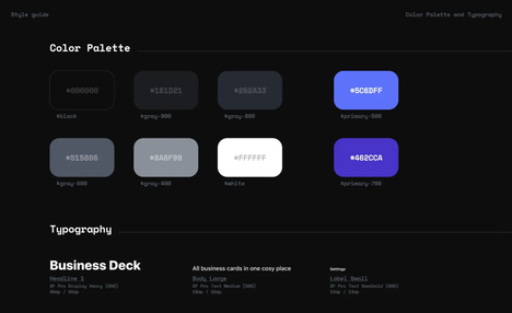
This matters for designers because it changes the handoff dynamic. When a component is owned by the codebase, not a package, the designer can open the actual source file and see exactly what tokens are being used, what spacing is applied, and what states are handled. No more guessing whether the developer used the right variant from the design system.
ReUI took this model further in 2026. It is a free, open-source registry of 966+ patterns built on shadcn/ui primitives — data grids with filters, kanban boards, multi-step forms, file uploads with drag-and-drop. Every pattern is copy-paste. Every pattern is TypeScript-first, dark-mode-compatible, and WCAG-accessible. With 2,600+ GitHub stars and active maintenance, it is the largest free pattern collection in the shadcn ecosystem.
💡 Tip: When evaluating any component kit in 2026, ask one question: "Do I own the code after I add it?" If the answer is no, keep looking. The copy-paste model is not a nice-to-have. It is the difference between a pattern library that accelerates your team and one that becomes a bottleneck.
The practical result for designers: you can now maintain a living pattern library where every component matches both your Figma file and your production code, because the code is yours to align. The design tokens in Figma map to the CSS variables in your components. The spacing in your auto-layout matches the Tailwind spacing scale. When something drifts, you fix it in one place.
This model has become so dominant that it is now the default for AI coding tools. When you ask an AI agent to build a dashboard, it reaches for shadcn/ui patterns because that is what its training data is saturated with. Which brings us to the most significant shift in pattern libraries this year.
Pattern Libraries Meet AI Agents: Mobbin MCP, DESIGN.md, and the New Design Intelligence Layer
In May 2026, Mobbin launched something that changes the game: an MCP server that gives AI coding tools direct access to 621,500 real app screens.
This is not a minor feature update. It is a category shift. Before Mobbin MCP, an AI agent generating a settings screen would pull from its training data — a statistical average of every settings screen screenshot it had seen during training. Generic. Plausible but forgettable. After Mobbin MCP, that same agent can query real, shipped settings screens from leading fintech, health, and SaaS products. The output references actual design decisions made by actual design teams.
Mobbin CEO Jiho Lim put it bluntly: "In the AI era, the challenge isn't generating interfaces — it's knowing what good looks like and how it works." The MCP server is in beta on all paid Mobbin plans, and early adopters are using it with Claude, Cursor, and Lovable.
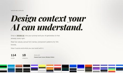
This is part of a larger pattern in 2026: pattern libraries are becoming machine-readable. Google Stitch's DESIGN.md format — a plain-text design spec that AI agents consume directly — hit 54,000 GitHub stars in under a month. The three-layer model of AGENTS.md (behavior), SKILL.md (tasks), and DESIGN.md (appearance) has become the standard way to make design intelligence available to AI tools.
What this means for designers: your pattern library is no longer just for human reference. It is training data for the AI agents that will generate a growing share of production UI. If your patterns are only in Figma, AI cannot see them. If they are only in code, designers cannot browse them. The winning pattern in 2026 bridges both worlds — visual reference for designers, structured tokens and rules for AI.
The tools to do this are emerging fast. The Figma-to-Markdown MCP server strips Figma designs down to structured Markdown that AI agents can act on. Designpull and TypeUI's Chrome extensions generate DESIGN.md files from any live website. Wireloom produces 300-token wireframes as inline SVG inside fenced code blocks — compared to 10,000–20,000 tokens for a PNG of the same UI.
The direction is clear: pattern libraries are evolving from static reference archives into live, queryable design intelligence layers that both humans and AI agents consume. That evolution changes what it means to build and maintain a pattern library, which is what the next section is about.
Building and Maintaining Your Own Pattern Library: Tools, Governance, and the Living Product Mindset
The most common failure mode I see is not picking the wrong tools. It is treating the pattern library as a one-time deliverable. You build it. You launch it. Six months later, it is a museum of obsolete decisions, and developers are working around it with inline styles.
The fix is treating it as a living product. Here is the stack and process that works in 2026:
For solo designers and small teams:
Figma is the foundation — components, variants, auto-layout, and shared libraries. Add Tokens Studio for managing design tokens that sync across files. For documentation, Zeroheight pulls your Figma components into a live, searchable reference site that both designers and developers can use. When you reach the point where design drift is costing more time than documentation takes, add Storybook to document the coded side and keep both worlds aligned.
For mid-size teams:
Add Chromatic for visual regression testing — it catches unintended visual changes to components before they ship. Add Supernova or Knapsack to connect Figma components to production code with automated token mapping. These tools answer the question "does what we shipped match what we designed?" without manual QA.
The governance model that prevents stagnation:
A design system researcher once described libraries that fail as "Design Systems Graveyards" — cluttered, outdated, full of components nobody uses but nobody dares delete. The antidote is simple:
Assign ownership. One person owns the library. They review additions, approve changes, and deprecate dead components. Rotation is fine. Ambiguity is not.
Follow the Rule of Three. Wait for the third real use case before adding a pattern to the shared library. The first use case is a component. The second is a coincidence. The third is a pattern.
Audit quarterly. Open your library. Find every component that has not been used in a new design in 90 days. Deprecate or archive it. A lean library gets used. A bloated one gets ignored.
Track drift. When a developer ships something that does not match the library, do not just fix the component. Ask why. Was the library missing a variant? Was the documentation unclear? Was the component hard to find? The fix is rarely just updating the code.
⚠️ Warning: The biggest killer of pattern libraries is not technical. It is that nobody's job description includes maintaining one. If the library is everyone's side project, it is nobody's priority. Carve out dedicated time or the library will rot.
The hard truth from the field: only about 40% of design systems are considered successful by their teams. The ones that succeed share one trait — they are treated as products with a roadmap, not projects with a deadline. Continuous investment is what separates a living pattern library from a folder of forgotten screenshots.
What Still Breaks in 2026: Drift, Discoverability, and the Designer-Developer Translation Tax
I am optimistic about the tools. I am less optimistic about the workflows they plug into. Here is what is still broken:
Design drift — the translation tax. When a designer creates a component in Figma and a developer rebuilds it in code, something is always lost. Spacing gets approximated. Colors shift by a hex value. States get missed. The UXPin team calls this the "translation tax," and nearly half of all teams report significant inconsistencies between design files and code. The fix is not better design tools. It is closing the gap so that prototypes use real production components — when the Figma file and the codebase pull from the same tokens, drift collapses to zero.
Discoverability. Most pattern libraries in 2026 are still referenced as GitHub repos or npm packages — not as visual, searchable galleries a designer can browse in thirty seconds. If I have to read a README to understand what a pattern looks like, the library has already failed me. The best tools — Mobbin, Screenlane, Zeroheight — are visual-first. Most are not.
The maintenance tax. Building a component is cheap. Documenting it, versioning it, testing it across breakpoints, auditing it for accessibility, and keeping it in sync with design — that is the real cost. Teams underestimate it every time. A pattern library with 50 components and zero documentation is worse than no library at all.
The AI accuracy gap. AI agents generating UI from pattern libraries is powerful but imprecise. An agent trained on shadcn/ui patterns will produce plausible output, but it will miss the nuances that make a design system coherent — the intentional tension between components, the rhythm of spacing across sections, the hierarchy implied by typography choices. Pattern libraries make AI better. They do not make it infallible.
None of these are reasons to avoid pattern libraries. They are reasons to be honest about what a pattern library can and cannot do. A pattern library reduces the cost of consistency. It does not eliminate it. The teams that succeed are the ones that budget for maintenance, invest in discoverability, and treat the library as a product — not the ones that pick the trendiest tools.
The pattern library landscape in 2026 is the best it has ever been. Reference galleries are richer. Component kits are more flexible. AI tools are starting to consume patterns directly. But the fundamentals have not changed: a pattern library is only as good as the team's commitment to using and maintaining it. Pick the right tier for your scale, invest in the workflow, and do not let the library become a museum.
Author
Linh Nguyen
Graphic Designer
Passionate Graphic Designer | Specializing in Illustration Design | Bringing Captivating Visuals to Life