Cover Image
You open a Figma file from six months ago and find three different button styles. Not variants of the same button — completely different buttons. One has 8px padding, another has 12px. One uses brand blue, another a slightly off shade you don't even recognize anymore. And that's just the buttons. Your cards, modals, and input fields all tell the same story: visual drift that happened one time-saving shortcut at a time.
This is the problem a UI pattern library solves. Not by locking you into a rigid system, but by giving you a single source of truth that makes every future design faster and more consistent. And here's the truth most tutorials won't tell you: you don't need a ten-person design ops team to build one.
This guide walks you through creating a practical, lightweight UI pattern library — built for the way solo designers and small teams actually work.
Why You Need a Pattern Library (Even as a Solo Designer)
The argument against pattern libraries when you work alone sounds reasonable: "I know my own files. Adding structure just slows me down." But the cost of not having one shows up in ways you notice only after they compound.
Every time you reuse a component by copying it from another file, you introduce a subtle variant — a different corner radius, a slightly darker shadow, a padding value that feels right but isn't what you used last time. Over three months of active design work, those micro-decisions add up to a UI that looks fragmented even though every individual screen looked good when you made it.
A pattern library fixes this at the root. Instead of storing components in your head or scattered across thirty project files, you keep them in one place. When you need a button, you grab the button — the exact same one you used in the last project, with the same tokens, the same states, and the same spacing. Your designs stay consistent, and your iteration speed actually increases because you stop rebuilding the same pieces from scratch.
Design teams with mature component libraries see a 34% improvement in task completion speed. And that benefit compounds the more projects you build on top of your library.
🚀 Pro tip: Think of a pattern library as a saved Figma component file with rules. The components save you time. The rules (tokens, spacing, usage guidance) keep you from drifting.
Audit Before You Build — Taking Stock of What You Already Have
The biggest mistake designers make when starting a pattern library is building components they think they need instead of components they actually use. You end up with a library full of beautifully crafted elements that never appear in your real designs, while the components you reach for every day aren't there.
Start with an audit instead. Open every recent project file and document every UI element that appears more than once. You will likely find patterns you did not expect — maybe three different card layouts, two distinct button hierarchies, or five subtly different shades of grey that are all supposed to be the same neutral.
Group what you find into three buckets using the Atomic Design methodology by Brad Frost as your organizing framework — atoms, molecules, organisms, templates, pages:
Keep — components used consistently across projects. These form the core of your library.
Consolidate — elements that serve the same purpose but look different. Pick the strongest version and standardize.
Cut — one-off components built for a specific context that never appear elsewhere. Leave these in their original files.
This audit does two things. First, it prevents you from building components nobody needs. Second, it reveals the actual consistency gaps in your work — which is exactly the material you need to make your library useful from day one. The U.S. Digital Gov team's guide on establishing reusable patterns is a great reference for this audit phase, even for solo projects.
The Tokens-First Approach (Without the Enterprise Bloat)
Design tokens are the foundation of any good pattern library. But if you have read about them before, you have probably encountered explanations designed for enterprise systems with hundreds of engineers. For a solo designer or small team, tokens can be much simpler.
Here is the only structure you need:
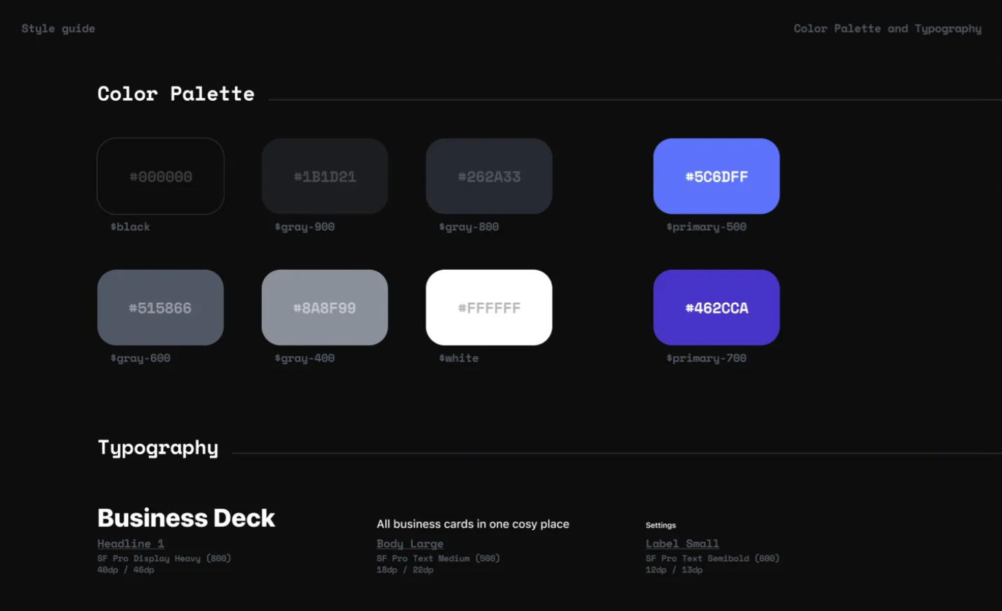
Primitive tokens store raw values. These are your base decisions: color-blue-500: #0835FB, spacing-4: 16px, font-size-lg: 1.25rem. Name them descriptively by what they are, not what they do.
Semantic tokens map primitives to purpose: color-primary: color-blue-500, spacing-card-padding: spacing-4. This layer is where your design decisions live. If you rebrand, you only change the semantic mapping — the primitives stay the same.
That is it. Two layers. No component tokens, no nested abstractions, no enterprise hierarchy. Just raw values and their purpose-driven aliases.
💡 Tip: Start tokens in your design tool (Figma Variables make this trivial in 2026), then export them as JSON for developers. Tools like Token Studio sync tokens between design and code automatically.
When you define tokens before building components, every element in your library inherits from a single source of truth. Change color-primary and every button, link, and accent in your library updates with it.
Building Your First 10 Components
Your first library should cover the 80% use case — the components you reach for in almost every project. Here is the minimum viable set:
Button — primary, secondary, tertiary, icon-only. Each with default, hover, active, focused, and disabled states.
Input — text, search, with and without labels. Error and success states included.
Select — dropdown with placeholder, selected, and options states.
Checkbox — unchecked, checked, indeterminate, and disabled.
Radio — unselected, selected, and disabled.
Card — default, clickable, and image-led variants.
Modal — with header, body, footer slots. Open, closing, and closed states.
Badge — default, success, warning, error, and neutral variants.
Avatar — image, initials, and fallback sizes.
Toast — success, error, warning, and info variants with auto-dismiss states.
For each component, design states before defaults. The default state is easy. It is the edge cases — disabled buttons, empty states, error conditions — that separate a professional library from a starter kit. If you design every state upfront, you will never have to scramble for a "loading" variant mid-project. The Pattern Library Playbook by Futurice has excellent Miro canvases for mapping out component states and usage contexts before you start designing.
⚠️ Warning: If a component has states you haven't designed yet, your developers will invent their own. That is how visual drift starts. Design every state before you ship.
Use auto-layout in Figma for all components. Every gap and padding value should reference your tokens, not fixed pixel values. This makes resizing and theming effortless.
Documentation That People Actually Use
A pattern library without documentation is just a folder of components. And documentation only matters if people actually read it.
The best approach is ruthlessly minimal. For each component, answer exactly four questions:
What is this? — One-sentence description of the component's purpose.
When to use it? — The primary use case, in plain language.
When NOT to use it? — This is often more valuable than the "when to use." If designers keep grabbing a modal when they should use a toast, document the distinction explicitly.
How do the states work? — Show all states with a brief note on what triggers each one.
That is it. No design principles essays, no brand philosophy, no multi-page style guides. Four bullet points per component.
Add a code snippet for developers — just the component name and key props — and you have documentation that serves both disciplines without demanding maintenance time you do not have.
Test your documentation with the 3-minute test: give a fellow designer (or future you) a task like "create a sign-up form using the library." If they can do it in under three minutes without asking questions, your docs work.
Keeping Your Library Alive — Maintenance Without Burnout
The hardest part of a pattern library is not building it — it is keeping it from becoming a museum. Libraries die when they fall out of sync with real designs. Designers stop using them, start working around them, and the consistency you worked for erodes.
You do not need a weekly review cadence or a dedicated maintainer. You need three habits:
Audit quarterly. Every three months, open your library alongside your most recent project file. Check for drift: are you using components directly, or have you started making local copies? If the detach rate exceeds 20%, something in your library is not meeting your real needs. Fix that component.
Add only when repeated. A common pattern deserves a component. A one-off layout does not. The rule is simple: if you have used the same element in three different contexts, add it to the library. If it is still a one-off, leave it in its original file.
Say no more than you say yes. Every component you add creates maintenance surface. Before adding a fourth card variant, ask yourself: does this genuinely serve a new use case, or can the existing variants handle it with slight adjustments? Libraries that grow without discipline become harder to use, not easier.
A pattern library is a garden, not a monument. Water it quarterly, prune what does not grow, and it will serve you for years instead of weeks.
You do not need a design ops team, a Figma Enterprise plan, or a 200-page documentation site to build a pattern library that works. Start with an honest audit of what you already use. Define tokens in two layers, not twenty. Ship ten components with their states. Write four lines of documentation per component. And maintain it like a garden — steady, minimal, consistent.
Your future self, opening a Figma file from six months ago, will thank you.
Author
Linh Nguyen
Graphic Designer
Passionate Graphic Designer | Specializing in Illustration Design | Bringing Captivating Visuals to Life