Cover Image
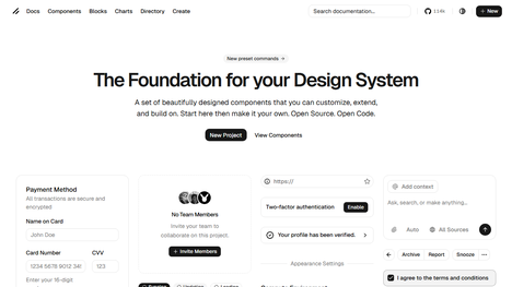
Ask an AI coding tool to build a landing page and you already know what you'll get before the first token renders. Inter font. Purple-to-blue gradient. Three feature cards in a row with Lucide icons. rounded-2xl shadow-lg on every surface. A centered hero section followed by a pricing table with the middle plan slightly elevated.
It's functional. It's complete. And it looks exactly like every other AI-generated interface on the internet.
This isn't an AI problem — it's a defaults problem. Language models predict the most statistically likely output from billions of public code samples, and the most likely output is overwhelmingly generic. The fix isn't better prompts. It's removing the defaults so the model can't fall back on them.
Here's how to do that, step by step, no design background required.
Why Every AI-Generated UI Looks the Same (and Why It Matters in 2026)
The convergence isn't mysterious. LLMs are trained on public repositories, tutorials, starter templates, and component libraries. When the training data is saturated with the same Tailwind defaults, the same shadcn/ui patterns, the same blog starter templates, the model learns one thing deeply: the statistical average.
Inter font appears in roughly 70% of Tailwind projects. bg-indigo-600 is the most common primary CTA color in component libraries. The hero → features → social proof → pricing → FAQ layout pattern is burned into thousands of landing page tutorials. The model isn't being creative — it's being accurate. It's giving you what the data says a landing page probably looks like.
In 2026, this is a branding liability. As We And The Color put it, generic design is being actively punished. Users have developed a sixth sense for AI-generated interfaces — the same way early-2000s visitors learned to spot template websites. When your SaaS landing page is indistinguishable from five competitors after removing the logo, you don't have a brand. You have a default configuration.
The good news: the problem is entirely structural. Fix the constraints, and you fix the output.
The Minimum Viable DESIGN.md: 5 Decisions That Do 80% of the Work
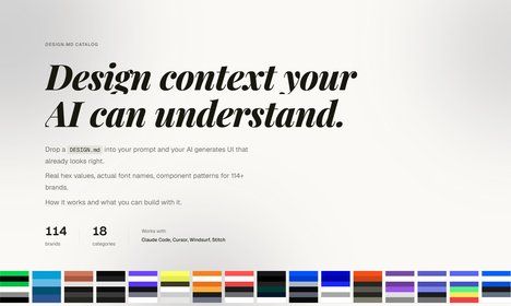
The single highest-leverage technique in 2026 is a plain-text design specification file that lives in your project root. OpenAI's GPT-5.4 design playbook calls this the single most impactful practice for production-quality AI UI, and tools like awesome-design-md (54,000+ GitHub stars) provide 66+ brand references ready to drop in. But you don't need a comprehensive system. Five decisions get you most of the way there.
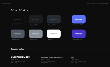
Decision 1: Replace the Color Palette Entirely
Don't extend Tailwind's default colors — replace them so the old tokens simply don't compile. Pick one primary, one surface/background, one text color, and one accent:
colors:
  primary: '#C8914A'      # all CTAs, links, selected states
  surface: '#FAF9F6'      # page background
  text: '#1A1A1A'         # headings
  text-secondary: '#4A4A4A' # body copy
  accent: '#2D4A7A'       # hover states, highlights
No pure black. No pure white. No indigo, violet, or purple anywhere. That alone eliminates half the AI look.
Decision 2: Pick Two Fonts, Then Ban Everything Else
One display font for headings. One body font for everything else. That's it:
/* Display: Georgia, 'DM Serif Display', or 'Instrument Serif' */
/* Body: 'DM Sans', 'Plus Jakarta Sans', or 'Switzer' */
Explicitly ban Inter, Roboto, system font stacks, and monospace-as-vibes. The font you choose signals more about your brand than any color does. If you change nothing else, change the font.
Decision 3: Define One Spacing Scale
Pick a base unit and commit to it. 4px is the web standard:
spacing: 4px, 8px, 12px, 16px, 24px, 32px, 48px, 64px, 96px
All padding, margins, and gaps must be multiples of the base unit. This sounds trivial. It's not. Inconsistent spacing is the second-most common tell of AI-generated UI after the font.
Decision 4: Choose One Component Vocabulary
Pick exactly one visual treatment for cards, one for buttons, and one for inputs — then apply it everywhere. The research is clear: AI defaults to rounded-2xl shadow-lg on every card because that's the statistical mode of the training data. Break that by defining variants:
const cardVariants = {
  default: 'border border-slate-200 bg-white',    // hairline border, no shadow
  elevated: 'bg-white shadow-sm',                  // subtle elevation only when needed
}
const buttonVariants = {
  primary: 'bg-[#C8914A] text-white rounded-md',   // 6px radius, not 16px
  ghost: 'text-[#C8914A] hover:bg-[#C8914A]/10',
}
No rounded-2xl. No shadow-lg by default. Cards only get elevation when they're the interaction target. Otherwise, a hairline border does the job.
Decision 5: Write the Forbidden List
This is the most important section and the one most DESIGN.md files omit. Explicitly ban the patterns the model defaults to:
## Forbidden
- ❌ Inter, Roboto, Arial, or system font stacks
- ❌ Purple, indigo, or violet in any color role
- ❌ `rounded-2xl`, `rounded-3xl`, or pill-shaped anything
- ❌ `shadow-lg`, `shadow-xl` on cards by default
- ❌ Glassmorphism (backdrop-blur on card surfaces)
- ❌ Centered hero → 3-card feature grid → FAQ accordion layout
- ❌ "Empower", "Unlock", "Transform" in any heading
- ❌ Lucide icons at 48px above feature cards
- ❌ Flat single-color backgrounds (use subtle patterns or imagery)
A 20-minute rough DESIGN.md is infinitely more useful than a perfect one you never write.
The Anti-Pattern Kill List: What to Ban on Day One
Beyond the DESIGN.md, there are specific patterns you need to actively hunt down in every AI-generated page. Here's the kill list with the replacement for each.
Anti-Pattern | Why It Screams "AI" | Replace With |
|---|---|---|
Inter / Roboto / Arial | Used in ~70% of AI output; invisible branding | A purposeful display + body pair (DM Serif + DM Sans, Instrument Serif + Switzer) |
Purple-to-blue hero gradient | The single most common AI default | A full-bleed photograph, subtle grain texture, or solid color with one accent element |
| Statistical mode of all component libraries |
|
Three feature cards in a row (centered) | The tutorial layout. Beige carpet in code form | Asymmetric grid: 2-col on desktop with one spanning element, staggered cards, or bento layout |
Hero → Features → Pricing → FAQ | Burned into training data from 10,000+ landing page tutorials | Start with the problem, not the product. Use case-study sections with real screenshots instead of feature cards |
Glassmorphism cards | Peaked in 2023, now reads as dated AI aesthetic | Solid surfaces with hairline borders. Let the content create hierarchy, not the blur |
Abstract placeholder copy ("Seamless Integration", "Empower Your Team") | LLMs default to marketing-speak when they don't know your product | Write one specific claim with a number. "Syncs with GitHub in under 3 seconds" beats "Seamless Integration" every time |
Monospace for "developer vibes" | Lazy shorthand that signals zero design decisions | Use your body font. If you need code, use a proper code block |
Large centered icons above every heading | Template pattern from every SaaS starter kit | Remove the icon. If the heading can't stand alone, rewrite the heading |
Hero-only layout (everything centered, full-width) | The vertical stack of sameness | Break symmetry: off-center hero text, overlapping images, content that spans uneven columns |
One way to enforce these at build time: ESLint custom rules that ban the class patterns. Is it petty to have CI fail on bg-indigo-600? Maybe. But it's more petty to ship something a user identifies as "that AI look" in three seconds.
The 3-Pass Polish Workflow: Structure, Style, Soul
The raw AI output is never the final product. The developers shipping professional AI-generated UI all use some variation of a multi-pass workflow. Here's the version I've settled on.
Pass 1: Structure (Fix Layout and Hierarchy)
Before touching a single color, fix the bones.
Open the generated page and run three tests:
The squint test. Stand back and squint until the page blurs. You should see one dominant visual mass, one secondary mass, and clear negative space between them. If everything is equal weight — a checkerboard of same-sized cards — your hierarchy is broken.
The headline scan. Read only the headings. Can you understand what the page does and why it matters? If the headings read like a generic SaaS template, rewrite them before touching anything visual.
The one-job test. Each section should do exactly one thing. If a section is trying to explain a feature, show social proof, and push a CTA, split it into three sections.
Fix structural issues first: collapse sections that repeat the same idea, expand sections that are too dense, and add breathing room between sections. If the hero is a centered text block with no image, add a full-bleed visual. If the features are in a 3-column grid, try a 2-column alternating layout instead.
Pass 2: Style (Swap the Visual Language)
Now apply your DESIGN.md. Replace the color palette token by token. Swap the fonts. Replace rounded-2xl shadow-lg with your component vocabulary. Kill every gradient and every instance of Inter.
This pass is mechanical, not creative. You're not designing — you're enforcing constraints. Go section by section and ask: would this element still look like it belongs to five other brands if I removed the nav bar? If yes, it needs more specificity.
Pass 3: Soul (Add the Human Layer)
This is where AI-generated UI becomes professional UI. Three things to add:
Motion. Two to three intentional animations minimum. One entrance sequence in the hero (a fade-up, a scale-in). One scroll-linked effect. One micro-interaction on hover. Fast, restrained, smooth on mobile. Remove anything that's purely ornamental.
Copy that sounds like a person wrote it. Read every heading and body text out loud. If you wouldn't say it to a colleague over coffee, rewrite it. Delete 30% of the copy — AI always over-writes. The litmus test: can someone scan the headings and understand the page in 10 seconds? If not, keep cutting.
One "imperfect" detail. AI output is pathologically smooth. Add one thing that breaks the perfection: a hand-drawn element, a slightly off-grid image, a deliberate asymmetry. Surrealism taught us that the uncanny lives in imperfection, and the same principle applies to UI. The difference between "that's cool AI art" and "wait, who designed this?" is one intentional flaw.
How to Know If Your UI Is Actually Good: 5 Objective Heuristics
"I know it when I see it" doesn't help if you're not a designer. Here are five tests that don't require taste — just eyes.
1. The Brand Removal Test
Remove the logo and navigation from the first viewport. Could this page belong to five other companies? If yes, your visual language isn't specific enough. The hero image, typography, color, and layout should be identifiable even without the logo.
2. The Grayscale Value Test
Take a screenshot, convert it to grayscale. You should see a clear range from dark to light — some areas near-black, some near-white, and a gradient of values between them. If the entire page is a uniform mid-gray, every element is fighting at the same visual volume. Pick one thing to make darker and one area to make lighter.
3. The Five-Second Count
Open the page and count how many individual elements your eye lands on in the first five seconds. If it's more than five, the page reads as noise — your eye is panicking, scanning for a place to land. Three to five focal points is the sweet spot. If you only land on one thing, the page is too flat.
4. The "Delete This Section" Test
For each section on the page, ask: if I deleted this entirely, would the page be worse or better? If "better" or "same," delete it. Most AI-generated pages have two to three sections that exist only because the template had them. FAQ accordions on product pages are the most common offender — if your actual users aren't asking those questions, the section is SEO filler, not user value.
5. The One-Week Rule
Ship the page. Use it for a week. The things that annoy you by day five — the button that's slightly too small, the heading that's slightly too vague, the spacing that's slightly off — those are the things worth fixing. The things you stop noticing were never problems to begin with.
Making It Stick: From One-Off to Repeatable System
The goal isn't to polish one page. It's to build a system where every AI-generated UI starts from your constraints, not the model's defaults.
Save your DESIGN.md as a project template. Put it in every new repo alongside README.md. When you start a new project, spend 10 minutes customizing the colors and fonts for that specific brand. The AI will read it automatically — Claude Code, Cursor, Copilot, and v0 all respect project-root design files.
Ban the defaults at the tool level. Add ESLint rules that flag banned Tailwind classes at build time. It takes 10 minutes to set up and saves you from shipping bg-indigo-600 because you were moving too fast to notice:
// .eslintrc.js — ban the AI defaults
const bannedClasses = [
  'bg-indigo-600', 'bg-violet-600', 'bg-purple-600',
  'rounded-2xl', 'rounded-3xl',
  'from-purple-', 'to-blue-',
]
Use the critique loop, not the rewrite loop. When the AI output isn't right, don't say "try again." Say "the hero text is too centered — left-align it and add an image that bleeds to the right edge." Specific, surgical feedback compounds. Vague feedback resets to the statistical average every time.
Run the five heuristics before every ship. Brand removal. Grayscale. Five-second count. Delete-section test. One-week rule. They take five minutes total and catch 90% of problems before a user ever sees the page.
The tools will keep getting better. The 38% annual growth in AI UI generation means next year's models will produce even more polished output out of the box. But polish isn't the goal — specificity is. The developers shipping professional work in 2026 aren't better at prompting. They're better at defining what "good" means for their specific product, then holding the AI to that standard with hard constraints, repeatable tests, and a willingness to say "this section is template filler, delete it."
Your taste is your only real moat. Everything else is just defaults.