Cover Image
Choose the condition the layout actually depends on
Use a media query when a rule depends on the viewport or a media feature, such as reduced motion or hover capability. Use a size container query when a component should respond to the space supplied by a containing element. A page can use both: media queries for its overall layout, container queries for reusable cards inside that layout.
That distinction explains a common sidebar problem. A card has room for two columns in the main content area, but becomes cramped in a narrow sidebar. The viewport stays the same while the component's available space changes. A viewport breakpoint alone cannot distinguish those placements.
This comparison focuses on size container queries. Other container query types, including style queries, have different conditions and support requirements.
Viewport conditions and container conditions
A rule such as @media (min-width: 900px) checks viewport width, not the width of each card. At a 1400px viewport, it applies whether the card is in a 300px sidebar or a wider main column. Those dimensions are an illustrative scenario, not recommended breakpoints.
A size query instead evaluates an eligible ancestor container for the element being styled. That ancestor need not be the direct parent. With an unnamed query, the browser selects the nearest eligible ancestor; a container name restricts selection to a matching eligible ancestor. MDN's container query guide explains the setup and naming behavior.
Condition you need to test | Useful starting point |
|---|---|
The viewport has room for the page's main columns | A width media query |
A card's allocated slot has room for image and text side by side | A size container query |
The user prefers reduced motion | A preference media query |
A primary input mechanism can hover | A hover media query |
A component appears in several differently sized slots | A container rule shared by those component instances |
A card that adapts to its available space
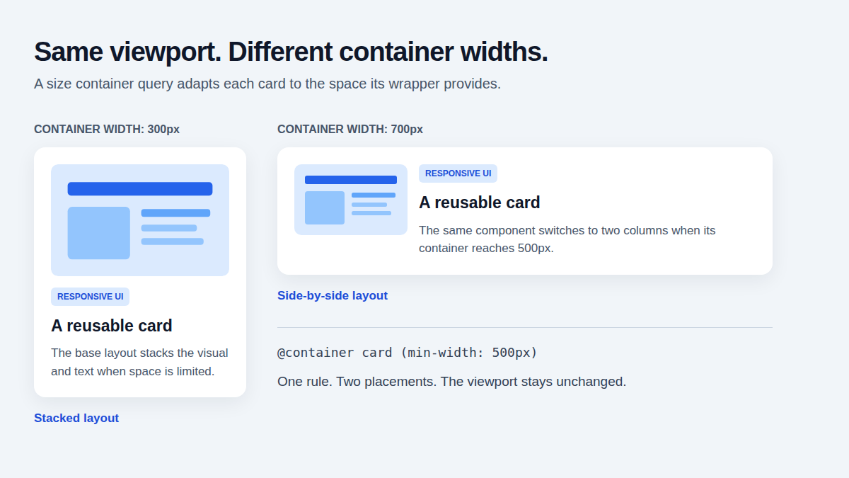
Put the containment context on a wrapper and style the card inside it. This illustration compares the same component at two container widths. The markup below uses a decorative visual block, so the example does not need an external image.
<div class="card-wrap">
  <article class="card">
    <div class="card-visual" aria-hidden="true"></div>
    <div class="card-body">
      <h3>Responsive card</h3>
      <p>Reusable content that adapts to its container.</p>
    </div>
  </article>
</div>
The wrapper gets its width from the surrounding layout. The card starts stacked, then switches to two columns when the named container reaches the example threshold:
            .card-wrap {
        container-type: inline-size;
          container-name: card;
            }
              /* A stacked card is the base layout and the fallback. */
                .card {
                  display: grid;
                    grid-template-columns: minmax(0, 1fr);
                      gap: 1rem;
                        }
                          .card-visual {
                            min-block-size: 8rem;
                              background: #dbeafe;
                                border-radius: 0.5rem;
                                  }
                                    .card-body {
                                      min-inline-size: 0;
                                        overflow-wrap: anywhere;
                                          }
                                            /* 500px is an example breakpoint, not a universal rule. */
                                              @container card (min-width: 500px) {
                                                .card {
                                                  grid-template-columns: 10rem minmax(0, 1fr);
                                                    align-items: start;
                                                      }
                                                        }
The same CSS can serve a sidebar card and a main-column card. At a 300px wrapper width, this example stays stacked; at 700px, it uses two columns. Choose the threshold by testing your actual image, text and spacing. The 500px value here is a demonstration, not a standard for product cards.
The second grid column uses minmax(0, 1fr), and the body allows long text to wrap. Still test long titles, translated copy and the assets your component will display.
Choose the containment type deliberately
For size-based layout work, the relevant choices are:
inline-size: enables size queries along the inline axis. In horizontal writing modes that corresponds to width; it is not universally the horizontal dimension.size: enables size queries in both inline and block dimensions. Size containment means those dimensions cannot be determined from the children's size in the usual way, so the surrounding layout or explicit sizing must provide suitable dimensions.normal: the default, which does not establish a size query container. It does not disable every other kind of container query.
These are the size-query choices discussed here, not an exhaustive list of every value or combination. Check the container-type reference for the complete definition and feature-specific compatibility.
Start with inline-size for a component that only needs to adapt along its inline axis. Use size when you need both dimensions and have designed how the container receives them. A fixed height is one possible arrangement, not a universal requirement.
Containment also affects sizing. A block wrapper stretching across its parent can receive its inline size from that context; it does not always need an explicit pixel width. Check more carefully when the wrapper is expected to size itself from its contents. Do not assume setting container-type alone gives it usable space.
Keep the wrapper and queried content separate
In this example, the wrapper establishes the size context, and the query changes a descendant card. A query based on the wrapper's size cannot use that same wrapper as its own ancestor container. Separating the roles avoids expecting the wrapper to restyle itself through its own size query.
When a component stops responding after nesting changes, inspect its eligible ancestors and names before adding more breakpoints. Naming the intended context helps make that selection explicit.
Keep media queries for page and preference rules
Media queries cover more than screen width. MDN's media query documentation includes media types and features such as viewport dimensions, hover capability and user preferences.
Use the appropriate condition for each decision. A page grid can change with viewport width. A card inside that grid can change with its container. A reduced-motion preference can affect transitions across both layouts. Container sizing does not replace those preference checks.
A navigation component may itself need container-based adaptation when it is reused in different slots. Treat “page versus component” as a helpful starting point, then identify the actual condition rather than assigning a query type from the component's name.
Make the base layout usable without the query
The stacked card above is its fallback. If the browser does not apply the container enhancement, the visual and text still have a usable single-column layout. Check that baseline before adding the wider presentation.
Consult the current size container query support table and the compatibility section for the exact property or query feature you use. Support for size queries does not establish support for style, scroll-state or other container query features.
Test the component in a narrow sidebar and a wide content column at the same viewport, then resize the viewport and the surrounding layout. Also inspect long content and zoom. For the code shown here, a Chromium check confirmed stacked and two-column layouts at the example container widths, plus a stacked fallback with size containment removed. That check does not replace testing your supported browser list.
A short decision checklist
Identify the condition: viewport, media feature, user preference or container size.
For a size query, find the eligible ancestor that supplies the relevant space.
Confirm how that container receives its dimensions, including writing mode.
Check narrow and wide placements, not only narrow and wide viewports.
Keep the base layout usable and test the required browser features.
Keep the page layout and the component layout independently testable. When a card breaks in a sidebar, first compare its allocated space with the condition your CSS is measuring. That will tell you whether to change the query, the container setup or the card's own layout.
Andy Phan
Let's connect and embark on this exciting tech journey together! 🌐💻#TechEnthusiast #WebOptimization