Cover Image
A form can use consistent fonts, tidy alignment, and a sensible spacing scale—and still make you wonder which label belongs to which field. That hesitation is a good reason to inspect its grouping.
The UX law of proximity describes how elements near one another tend to look related. In an interface, the practical question is what that arrangement tells someone about the content and actions they see.
Start with the relationship you want to communicate: this instruction belongs to this field; this price belongs to this product; this action affects this item. Then choose spacing that makes that relationship clear.
This guide offers six checks you can use in a design review. The examples and spacing values are illustrative starting points, not measured performance claims or universal rules. You can apply them to a spacious landing page or a compact work tool, beginning with the meaning of the groups.
1. What the UX law of proximity tells you about a layout
Imagine a café counter with three cups clustered beside a tray and one cup sitting off to the side. You might reasonably assume the three cups belong to one order. Move the fourth cup into the cluster, and the apparent relationship changes without adding a label.
A layout sends similar signals. A discount badge beside a price looks connected to that price. Place it halfway between two products and its meaning becomes less obvious.
Nielsen Norman Group’s proximity guidance explains this grouping principle and shows why responsive changes can alter those relationships. Nearby items tend to be perceived as a group, while separation suggests a boundary.
Use that idea as a review question: does the visible grouping match the intended meaning? A neat grid alone cannot answer it. Before adjusting any gaps, identify the groups the layout needs to express.
2. Choose spacing from relationships, then use tokens
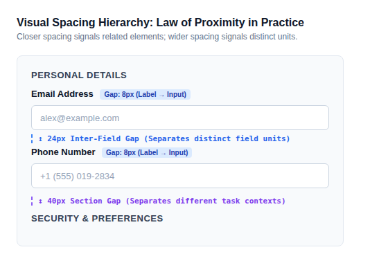
Consider a contact form with a label, an input, and a short instruction. These form a small unit. Two such units make a larger section, and that section might sit beside a separate notification preference.
Give those levels distinct roles in your spacing system. For a prototype, you might try:
Relationship | Illustrative starting gap | Check |
|---|---|---|
Label to its input | 8px | Does the label clearly belong to this control? |
One field unit to the next | 24px | Can you distinguish the fields? |
One named section to another | 40px | Is the change of topic apparent? |
These values are choices for this example. They are not accessibility thresholds or a scientific ratio. Long labels, larger text, borders, and a compact viewport can all change how a group looks.
Our guide to advanced UI design principles puts grouping alongside the other decisions that shape an interface.
Tokens make choices repeatable. Name them by their purpose—such as field gap or section gap—so someone implementing the design understands when to use them. A scale helps keep the work consistent, but choosing a value from that scale still requires judgment.
If every gap is identical, ask whether the interface has flattened relationships that should look different. If the page feels too spread out, inspect the largest gaps before shrinking everything. The next check applies that reasoning to familiar components.
3. Fix ambiguous grouping in forms, cards, and actions
Forms: keep the field unit together
Try this review exercise: cover the field text and look at the remaining shapes. Does each label sit clearly with one input, or appear suspended between two?
Keep a field’s label, control, and relevant instruction together. When adding an error message, check that it still appears to belong to the affected field. An error inserted into the gap between fields can accidentally look like an instruction for the next one.
Cards: make ownership visible
Imagine two membership cards, each with a title, price, description, and Select button. An equal gap between every element may look orderly, yet leave the button visually detached from its plan.
Review the distance within each card alongside the distance between cards. Padding, background, and borders can reinforce the boundary. Try longer descriptions too: the design should still communicate which button selects which plan when one card becomes taller.
Actions: show what each action affects
In a file manager, Rename belongs to the selected file; Upload belongs to the collection. Placing both in one undifferentiated row makes the scope harder to infer.
You might keep item actions beside the selected item and collection actions near the collection heading. Explicit labels and a visible selection state can support that choice. Spacing contributes to the explanation, but should not carry the entire burden.
Once these relationships work on the initial screen, test what happens when the layout changes shape.
4. Keep groups intact when the layout reflows
Picture a desktop event listing with a title in the first column, a date in the second, and a Book button in the third. A mobile layout that stacks whole columns would produce all titles, then all dates, then all buttons. The desktop alignment has hidden a structural problem.
Build the layout around each event instead. Within an event, the title, date, and action can rearrange while remaining one unit.
Review more than the narrowest and widest mockups. Intermediate widths are useful for spotting a label that wraps, a button that drops below a neighbouring group, or a row that becomes unusually tall.
Use deliberately awkward content:
A title twice as long as the sample.
An instruction that wraps across several lines.
An error state that adds content beneath a field.
Larger text that changes the component’s proportions.
Ask someone to identify which date belongs to which event and which action they would choose. A layout that fits the viewport may still communicate the wrong relationships. After checking the visible structure, inspect the structure available to assistive technology.
5. Give visual groups accessible structure
Moving text beside a control does not programmatically associate the two. W3C’s labeling tutorial shows how to connect a visible label to its control. For related choices, its grouping tutorial explains using fieldset and legend to provide a group name.
The diagram below shows an email field with its label and instruction, followed by a named group of delivery options:
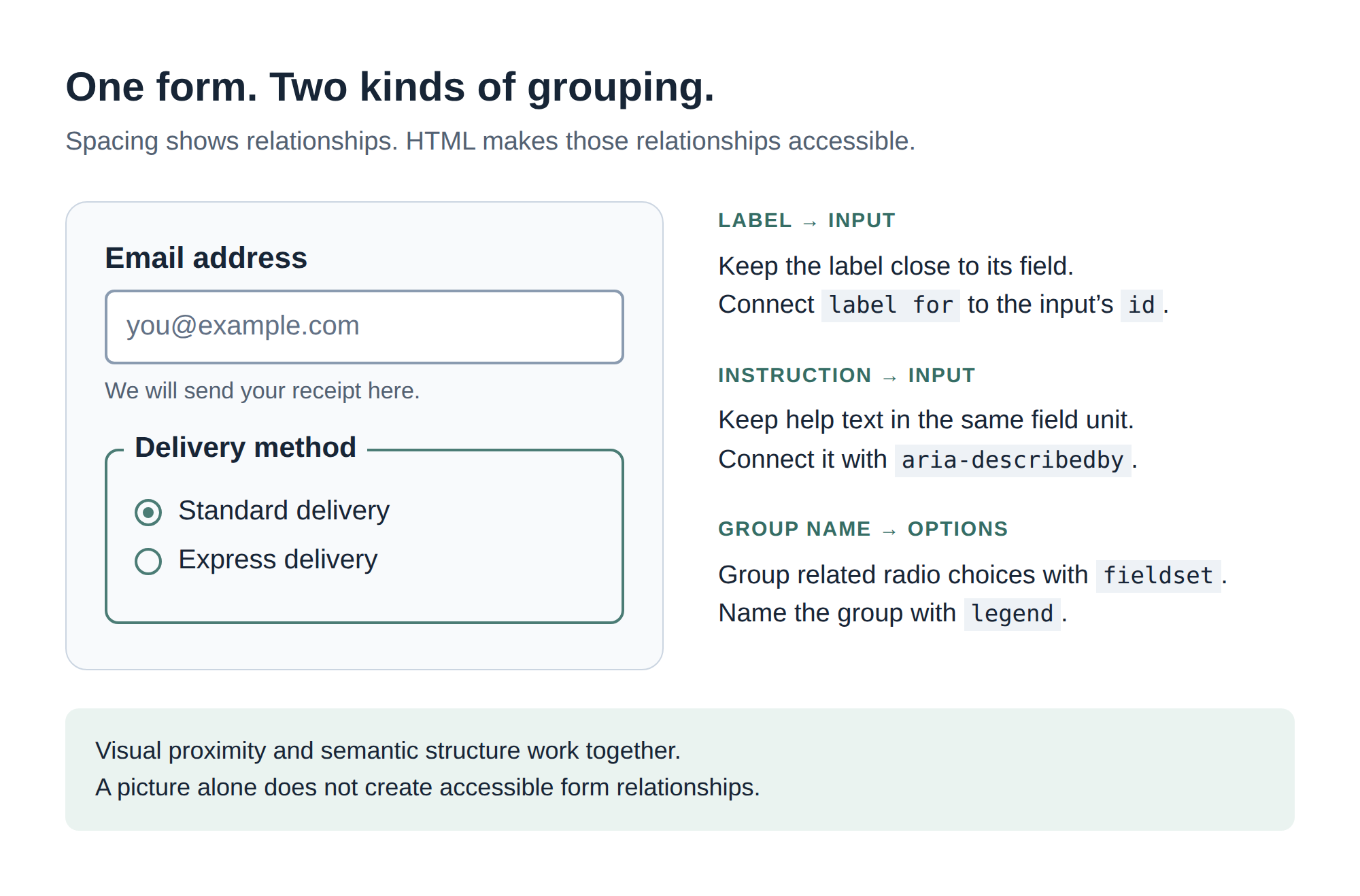
Keep each label close to its field and connect it in HTML using matching label for and input id values. Associate the instruction with aria-describedby. Use fieldset and legend to group and name the delivery options. Spacing shows these relationships visually; the markup makes them available to assistive technology.
Include a keyboard check and a screen-reader check in the component review. Listen for the field name and instruction, then check the named choices. Bring both the visual and semantic findings into the final task-based audit.
6. Audit proximity with a task, not a pixel rule
A spacing review becomes more useful when the person reviewing has something concrete to do. For a booking interface, ask them to find a particular event and identify its date and booking action. For a form, ask them to explain what information belongs in a field.
Try this sequence:
State the intended groups. Write a short description of what belongs together and why.
Inspect the visible groups. Look for a heading, instruction, badge, or action that seems to belong elsewhere.
Stress the content. Add longer text and realistic errors, then resize the layout.
Check the markup. Confirm labels and group names represent the intended relationships.
Observe the task. Note hesitation or mistaken associations; ask what caused them.
Revise the relevant gap. Keep other variables stable where possible, then compare the result.
Density belongs in this conversation. A person comparing many records may need more information visible at once. Another person completing an unfamiliar form may benefit from clearer section breaks. Treat both as design situations to investigate, rather than assuming one spacing style suits every task.
The UX law of proximity gives you a useful question for either case: what does this arrangement make people think belongs together? Start with one uncertain label, one detached instruction, or one action with unclear scope. Make its relationship easier to read, and test it in the screen where someone will actually use it.
Linh Nguyen
Graphic Designer
Passionate Graphic Designer | Specializing in Illustration Design | Bringing Captivating Visuals to Life