Cover Image
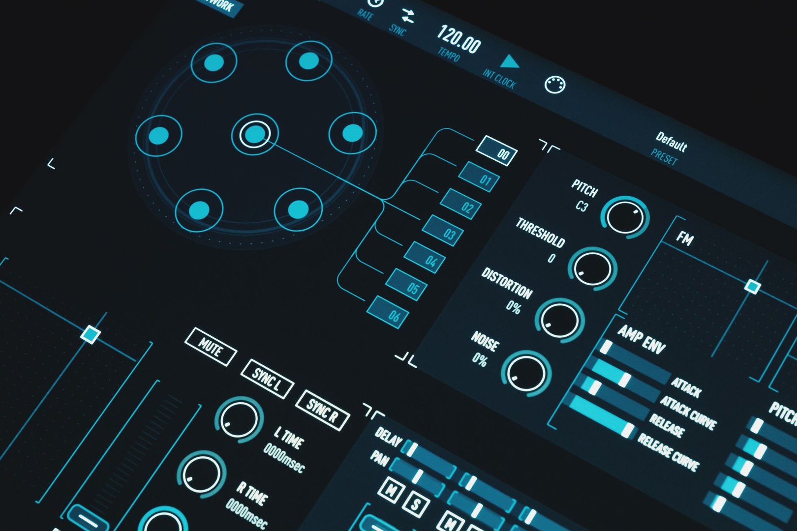
Micro-interactions help people understand what an interface is doing: a button acknowledges a press, a saved item confirms a change, and an error explains how to recover. For a vibe-coded app, the most useful place to start is the main user task. Follow it from the first click to the final result, then fill in the states that feel uncertain.
A beautiful hover effect won't fix a save button that says “Done” before the request succeeds. Get the behavior right first. Add motion where it makes that behavior easier to follow.
This guide expands six patterns you can use in forms, dashboards, generated result lists, and small tools. The code examples are starting points for integration into your own components. If your layout still needs work, pair these changes with our guide to making AI-generated UI look professional.
Key Takeaways
Define idle, pending, success, and error states before choosing an animation.
Keep feedback close to the action and preserve the user's work when a request fails.
Reserve space for changing labels, icons, and results so feedback doesn't move nearby controls.
Support keyboard input, touch, and reduced motion alongside pointer effects.
Treat animation timings as starting values to test, rather than universal rules.
1. State-changing buttons that explain the result
A save button needs to answer three questions: did the click register, is the request still running, and did the change reach the server? A spinner can communicate the middle state. A changing label gives the user more context.
Use a small state model instead of unrelated booleans such as isLoading, isSaved, and hasError. Those flags can accidentally produce contradictory combinations.
State | Visible label | Expected behavior |
|---|---|---|
Idle | Save changes | Accept the action |
Pending | Saving… | Prevent duplicate submission |
Success | Saved | Confirm the server accepted the change |
Error | Try again | Preserve input and explain the failure |
Keep the button's footprint stable. The original temptation is to animate its width as the label changes, but that can shift adjacent controls. Reserve enough room for the longest label and animate a small icon or background instead.
.save-button {
  min-inline-size: 9rem;
  min-block-size: 2.75rem;
  transition: transform 120ms ease-out,
              background-color 160ms ease-out;
}

.save-button:active:not(:disabled) {
  transform: scale(0.98);
}

.save-button:focus-visible {
  outline: 2px solid currentColor;
  outline-offset: 3px;
}

.save-button:disabled {
  cursor: wait;
}

@media (prefers-reduced-motion: reduce) {
  .save-button { transition: none; }
  .save-button:active:not(:disabled) { transform: none; }
}
These durations and dimensions are example choices, not accessibility thresholds. Test the component with your actual font, translations, and narrowest supported viewport.
Keep a status element near the button and mount it before requests begin. Update its text when the operation finishes. The W3C guidance on status messages explains how assistive technology can receive updates without moving focus. A decorative checkmark alone doesn't convey the result to everyone.
For a short action, let success remain visible until the next edit or action. For a failure, keep the explanation available long enough to read and act on. Avoid clearing it just because an animation has finished.
2. Inline progress that keeps the surrounding interface usable
Put loading feedback inside the region being updated. If a dashboard card is refreshing, keep the navigation and other cards usable. If a form is submitting, prevent conflicting edits only where the operation requires it.
Choose a progress indicator based on what the app actually knows:
Use a determinate bar when you have measurable progress, such as bytes uploaded.
Use an indeterminate indicator when you cannot measure how much of the task is complete.
Use skeletons when the structure of the incoming content is predictable.
Use textual steps when the server provides meaningful milestones.
Don't label a request “90% complete” because a timer has reached an arbitrary point. A small “Generating your preview…” message is more honest and easier to maintain.
For skeletons, match the expected content's size rather than scattering gray rectangles across the page. Reserve the thumbnail area, title lines, and metadata row. Replace them in place when the result arrives. Disable decorative shimmer for people who request reduced motion; the placeholder still communicates that content is pending.
If content is streamed, avoid announcing each token through a live region. Show the changing text visually, then announce a useful milestone such as “Draft generated.” Keep pause or cancellation controls accessible when your app supports them.
Optimistic updates deserve separate handling. Suppose a user adds a task. You can insert a pending row immediately, give it a temporary identifier, and replace that identifier after the server confirms the creation. If the request fails, retain the row with a retry action or return the entered text to the form. Silently removing the row can make the user think their work vanished.
Use optimism for changes you can recover cleanly. An irreversible action needs an explicit server result. In both cases, the animation should reflect the state your application has reached.
3. Cursor-tracking glows as optional decoration
A restrained glow can give a dark card depth, especially when the card represents a selectable project or workspace. Keep its text readable without the effect, and give keyboard users a visible focus treatment.
For a simple implementation, place a radial gradient on a pseudo-element. Give it pointer-events: none so it doesn't interfere with the card's actual controls.
.glow-card {
  position: relative;
  overflow: hidden;
  isolation: isolate;
  background: #171717;
}

.glow-card::before {
  content: "";
  position: absolute;
  inset: 0;
  z-index: -1;
  pointer-events: none;
  opacity: 0;
  background: radial-gradient(
    240px circle at var(--mouse-x, 50%) var(--mouse-y, 50%),
    rgb(255 255 255 / 0.08), transparent 75%
  );
}

@media (hover: hover) and (pointer: fine) {
  .glow-card:hover::before { opacity: 1; }
}

.glow-card:focus-within {
  outline: 2px solid #a5b4fc;
  outline-offset: 3px;
}

@media (prefers-reduced-motion: reduce) {
  .glow-card::before { display: none; }
}
const card = document.querySelector('.glow-card');
const finePointer = matchMedia('(hover: hover) and (pointer: fine)');
const reducedMotion = matchMedia('(prefers-reduced-motion: reduce)');

card?.addEventListener('pointermove', (event) => {
  if (!finePointer.matches || reducedMotion.matches) return;
  const bounds = card.getBoundingClientRect();
  card.style.setProperty('--mouse-x', `${event.clientX - bounds.left}px`);
  card.style.setProperty('--mouse-y', `${event.clientY - bounds.top}px`);
});
This example attaches to one card. In a component framework, attach the listener through the component's event system and clean up any manually registered listeners when the component unmounts.
Moving a gradient can trigger painting. Profile it before applying it to every card in a dense dashboard. The web.dev guide to animation performance explains why transforms and opacity are preferable when an effect can use them, and why you still need to inspect rendering work.
Skip the glow when it competes with information. A table of errors, a payment form, or a text-heavy editor rarely benefits from lighting that follows the cursor. For packaged alternatives, our animated UI library guide can help you compare implementation options.
4. Short, bounded entrances for new results
When several generated results arrive together, a slight fade and upward movement can make their appearance feel less abrupt. Keep the delay bounded so later items don't wait behind an elaborate sequence.
.result-item {
  animation: result-in 180ms ease-out both;
  animation-delay: var(--delay, 0ms);
}

@keyframes result-in {
  from { opacity: 0; transform: translateY(6px); }
  to { opacity: 1; transform: translateY(0); }
}

@media (prefers-reduced-motion: reduce) {
  .result-item { animation: none; }
}
document.querySelectorAll('.result-item').forEach((item, index) => {
  item.style.setProperty('--delay', `${Math.min(index, 4) * 30}ms`);
});
The last example caps the delay at 120ms. That's a design choice for this snippet; adjust it after trying a realistic result set. Without the cap, even a small delay accumulates across a long list.
Apply entrance animations to newly added items. Don't replay the entire list whenever a filter changes, a background refresh completes, or a parent component re-renders. Stable item keys help your framework preserve identity, but the animation trigger also needs to distinguish new content from an ordinary update.
For lists with interactive items, remember that opacity doesn't remove a control from keyboard navigation. Avoid long invisible delays that let focus land on something the user can't yet see. A small entrance should never postpone access to the result.
Dense tables often work better with a brief highlight on the changed row. Preserve selection, scroll position, and focus rather than animating every cell.
5. Local copy confirmation and readable counter changes
A copy action usually needs a confirmation next to the control. Change “Copy snippet” to “Copied,” optionally replace the icon, and announce the result through a nearby status element.
Only show success after the clipboard operation resolves. The MDN documentation for clipboard writing describes the promise-based API, its secure-context requirement, and potential rejection.
Counters need a different decision. A brief transition can help draw attention to a changed count, but rolling every digit of a frequently updated metric adds distraction. Keep exact values easy to read, use font-variant-numeric: tabular-nums, and reserve sufficient width.
Avoid animating through intermediate values for information where readers need an exact result, such as a final invoice total. For an optional decorative ticker, expose the final value to assistive technology and hide intermediate animation frames from it. With reduced motion enabled, display the final value immediately.
Tooltips also need more than a spring animation. Make the information available on keyboard focus, and ensure essential instructions remain accessible on touch devices. Don't put the only explanation of a disabled action behind a hover-only tooltip.
6. Validation and recovery that preserve the user's work
Error handling is a micro-interaction because it answers an immediate question: what happened, and what can I do next? Put the answer near the affected field or operation.
For a form, show a specific message such as “Enter an email address in the format name@example.com.” Associate it with the field through aria-describedby, and set aria-invalid="true" while the field is invalid. Keep the message visible until the user fixes the problem or submits valid input.
Choose when validation appears. Showing an error on the first keystroke can interrupt someone who is still typing. For many ordinary forms, validating on blur or submission is a reasonable starting point. Once a field has an error, updating that error as the user corrects it can reduce repeated submissions.
For server failures, preserve all entered values. Distinguish a field problem from a connection failure: “This name is already taken” calls for an edit, while “We couldn't save your changes. Try again” calls for retrying the operation.
Be careful when a request times out. The server may have accepted it even though the browser didn't receive the response. For actions that must not happen twice, coordinate with your backend on idempotency or reconcile the current state before retrying. A polished retry animation can't solve duplicate processing.
A gentle border change or icon can draw attention to the message. Avoid relying on red alone, and skip shaking an entire form. The useful part is the explanation and recovery path.
Build a small motion system before adding more effects
Use a few shared tokens so generated components don't each invent their own timings. For example, start with a short press response, a slightly longer state transition, and a bounded entrance animation. Try them together in the real flow before treating them as defaults.
Prefer targeted transitions over transition: all. Explicit properties make it easier to see why a component moves and reduce surprises when another style changes. Test both the normal and reduced-motion versions; MDN's reduced-motion reference explains how the media query reflects the user's preference.
Give your coding assistant a behavioral specification rather than “make it feel premium”:
Update the existing save control with idle, pending, success, and error states. Keep its dimensions stable. Prevent duplicate requests while pending, preserve form values on failure, and announce the result in a persistent status region. Add a small press transform and remove decorative motion when reduced motion is enabled. Follow the project's existing component and styling conventions.
That prompt gives you something concrete to review. Ask for one component at a time, then check its actual behavior before applying the pattern elsewhere.
A practical review checklist
Run through the main task under conditions that expose missing states:
Normal completion: confirm that success follows the real server result.
Slow response: check that the pending state stays understandable and duplicate submissions are blocked.
Failed response: verify that input survives and retry instructions fit the failure.
Keyboard navigation: look for visible focus and sensible focus placement after updates.
Touch input: confirm that no essential information depends on hover.
Reduced motion: ensure decorative movement stops while status remains clear.
Repeated actions: check for stale messages, overlapping timers, and replayed list animations.
Long content: test translated labels, large results, and narrow screens for unexpected movement.
Start with the action people use most. Make its pending, success, and failure states clear, then carry those decisions into the rest of the app. The result should feel predictable even when the connection is slow or the request fails.
Author