Cover Image
What makes an animated UI library AI-ready?
An AI coding assistant can help add a glowing button. That does not mean it understands when the button should move, what happens when motion is reduced, or whether the component belongs in your product at all.
The best animated UI libraries for AI coding give the assistant useful material to work with: readable source, clear installation instructions, predictable dependencies, examples that match the stack, and enough context to make a change without guessing. They also leave you with code you can inspect and own.
This is a practical shortlist rather than a universal ranking. The libraries solve different problems, and this guide does not present a controlled benchmark of their speed. Use the categories below to choose a starting point, then test the actual component in your page.
The shortlist: four useful starting points
Magic UI: best for polished marketing sections
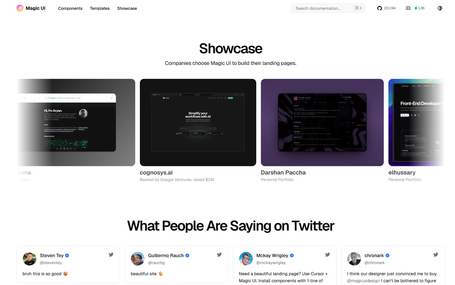
Magic UI is a strong first stop for SaaS pages, portfolios, and AI product landing pages. Its catalog includes marquees, bento grids, text effects, device mockups, buttons, backgrounds, and small interaction patterns. Components are designed for a React, Tailwind, and shadcn-style workflow.
The library also has an official MCP server. That gives supported AI-assisted editors direct access to Magic UI components instead of asking the model to reconstruct an API from memory. If your workflow includes Cursor or another supported tool, this is a concrete advantage.
Choose Magic UI when you already know the page section you want and need a polished starting point. Keep its visual language under control. A page does not become more useful because every heading, border, and background moves.
React Bits: best for expressive effects and source variants
React Bits is a large collection of animated React components, text effects, backgrounds, and interactive pieces. Its README documents JavaScript and TypeScript versions with CSS or Tailwind variants, and the installation guide supports both manual copying and CLI workflows.
React Bits also documents using the shadcn MCP server with its registry to browse, search, and install free components. That range makes React Bits useful for a portfolio or campaign whose identity depends on a particular text treatment or background. You can choose the variant that fits your project instead of translating the styling system later.
Read the dependency information for the exact component you want. “React Bits” is a catalog, not a single performance profile. A simple text effect and a canvas-like background have different costs and different testing needs.
Animate UI: best for restrained, copy-first motion
Animate UI describes itself as an open distribution of React components built with Tailwind CSS and Motion. Its source-first model lets you copy a component into your project, change it at the implementation level, and keep the result close to your own design system.
This approach is useful when you want animation primitives and baseline components without committing to a large visual identity. Animate UI also calls out performance and accessibility as design goals. Treat those as starting points, then verify the actual component with your content and device targets.
Aceternity UI: best for dramatic landing-page effects
Aceternity UI is aimed at animation-heavy landing pages, hero sections, spotlights, and 3D-style visual treatments. It is a reasonable candidate when the visual effect is part of the campaign concept.
It is less useful as a default for every product surface. Keep expressive effects near the places where they communicate the product or establish a visual direction. Forms, settings, tables, and repeated workflows usually need faster, quieter feedback.
Compare the implementation path, not just the gallery
Before choosing a component, answer five practical questions:
Can the assistant see the component's source and exact installation command?
Does the component match the project's React, TypeScript, CSS, and Tailwind setup?
Can the team edit the code directly and maintain it after the first draft?
Is the license suitable for the project and how the team distributes its work?
Can you define a static and reduced-motion state for the same component?
Source distribution gives an AI assistant concrete implementation details to inspect. The shadcn-style approach copies code into the repository, which lets an assistant inspect the component beside your own tokens, patterns, and constraints. It also means your team owns the maintenance work.
The licensing details differ. Magic UI's free repository uses the MIT license. React Bits' repository uses an MIT license with a Commons Clause condition that restricts selling, sublicensing, or redistributing the components themselves. Read the applicable terms before including copied components in a template, library, or client deliverable. Do not treat a paid catalog as part of the free collection.
Give the AI assistant better context than “make it cool”
An assistant needs a design brief, not only a component name. Give it the page goal, the content hierarchy, the existing design tokens, and the interaction constraints.
For example:
Add a single Blur Fade reveal to the project-card section.
Keep the heading visible in the initial HTML and do not delay navigation.
Use the existing spacing and color tokens. Animate opacity and a small vertical offset.
Disable movement when prefers-reduced-motion is enabled.
Test at 375px and 1440px widths, then report the files and dependencies changed.
This instruction gives the assistant a target, boundaries, and a way to show its work. If your tool supports an MCP server for the library, use it to retrieve the component's current installation and usage details. Otherwise, give the assistant the official component page or copied source as context.
AI-generated animation still needs visual judgment. A model can satisfy the syntax and produce a page that feels busy, delays content, or uses the wrong focal point. Ask it to explain the motion's job, then remove the effect if the explanation is only “to make it feel premium.”
Test motion before shipping
A component demo does not show how an effect behaves in your complete page. Check whether reveals delay access to content and whether the timing, performance, and interaction API fit your project.
Use a short acceptance checklist for every component:
Read the content on a narrow screen while the animation runs.
Navigate with a keyboard and confirm that focus is always visible.
Refresh, navigate away, and return. Decide whether the effect should replay.
Test a representative phone, not only a fast development machine.
Enable
prefers-reduced-motionand confirm that essential content appears immediately.Watch for layout shifts, text overlap, and effects that obscure controls.
For Motion-based components, the useReducedMotion documentation describes how to replace movement with opacity changes, remove parallax, or turn off decorative motion. Decide the fallback at the design level first. A loading state may need a non-moving indicator; a decorative background may become static; a status change still needs a clear visual or textual signal.
Do not turn community reports into universal performance claims. A lag report may depend on the browser, the component, positioning, or the rest of the page. Use those reports to decide what to test, then measure your implementation.
Which library should you choose?
Start with Magic UI when you need a recognizable marketing pattern and your project fits its React, Tailwind, and shadcn workflow. Its MCP server is useful when your AI editor can use it.
Start with React Bits when the project needs an expressive text effect, unusual background, or a choice between CSS and Tailwind variants. Inspect each component's dependencies instead of assuming the catalog has one performance profile.
Start with Animate UI when you want source-owned, Motion-powered primitives that can sit quietly inside an existing design system. Start with Aceternity UI when a landing page genuinely calls for a dramatic visual treatment.
The final choice should come from the smallest component that solves the design problem. Let the assistant find and adapt that component, then review the code, motion behavior, accessibility, and license yourself. AI can shorten the path from an idea to a working effect. It cannot decide whether the effect deserves to be there.
Linh Nguyen
Graphic Designer
Passionate Graphic Designer | Specializing in Illustration Design | Bringing Captivating Visuals to Life