Cover Image
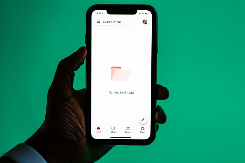
Start with the reason the screen is empty
A customer selects a size and a price range. The product grid disappears. In its place: a drawing of a box and “Nothing here yet.”
Did the store run out of products? Did the filters remove everything? Did the request fail? The screen leaves the customer to diagnose the problem.
Empty state UX should explain why content is missing and help someone continue their task. Sometimes that means creating a first project. Sometimes it means removing a filter. Sometimes it means saying that the work is finished and leaving the person alone.
The useful starting point is the cause. Before choosing an illustration or writing a button label, finish this sentence: “This area has no content because…”
Give each cause its own response
Situation | What the person needs to understand | Useful response |
|---|---|---|
First use | This feature has no content yet | Explain what belongs here and offer the first meaningful action |
No search or filter matches | Content exists, but the current conditions found none | Keep the search visible and offer a relevant adjustment |
Completed or cleared work | The absence of content is an expected outcome | Confirm what happened; offer undo only when it exists |
Missing permission | The account cannot view this content | Explain how to get access without exposing restricted details |
Request failure | The system could not determine what to display | Show an honest error and an appropriate recovery path |
Still loading | The answer is not known yet | Communicate progress; do not declare the area empty |
Design-system terminology varies. Carbon’s empty-state guidance includes no-data and error-management cases. Whatever your component is called, the product must distinguish these causes: an unsuccessful request does not establish that a collection is empty.
Think of a closed shop. “Not open yet,” “closed for maintenance,” and “entrance around the corner” all explain an unavailable doorway. The same sign would not help in all three situations. A reusable empty-state component needs that same flexibility.
Once the cause is clear, the message can become specific.
Write empty state UX copy for the actual task
A useful message usually has a short heading, any explanation the heading cannot provide, and an action when there is something useful to do. These are available parts, not a requirement to fill every slot.
Start by saying what is missing. Add the reason if it matters. Then name the action by its outcome.
First use: make the first action concrete
For a new workspace, “No data available” describes the database rather than the person's task. Try:
No projects yet
Create a project to keep its files and feedback together.
Create project
The heading identifies the missing object. The description explains why someone would create it. The button names the same object, so the destination is predictable.
If only an administrator can create projects, this copy is wrong for a regular member. Offer an action available to that role, such as contacting the workspace owner. A disabled create button with no explanation leaves the first-use problem unresolved.
Completion: allow the task to end
After someone reviews the last flagged comment, a quiet “All comments reviewed” may be enough. There is no need to invent a new task to justify a large button.
Atlassian’s empty-state writing guidance distinguishes completed or cleared work from a first-use blank slate. That distinction helps avoid showing onboarding instructions to an experienced user who has just finished their work.
Also check whether the interface knows what happened. An empty inbox does not prove the user cleared it; there may never have been messages. “No messages” is safer than a congratulatory claim the product cannot support.
Failure: acknowledge the interruption
For a failed request, use wording such as “We couldn’t load your saved items.” If retrying can help, label the button “Try again.” Keep the query, filters, and other recoverable input intact.
Avoid “Your saved items are empty” when the server never returned an answer. Avoid cheerful completion language when someone may be worried about lost work.
An illustration can give a large first-use screen some character. In a narrow panel, it may take space away from the explanation. In an unexpected failure, it may feel dismissive. Test the message without the artwork first. If the situation is still unclear, the drawing is unlikely to fix it.
With the message established, the next question is whether its action actually helps.
Make storefront recovery specific and reversible
An empty product grid deserves more than “Try a different search.” The shopper has already told you something about what they want. Keep that information visible and use it to make recovery easier.
Imagine a query for black linen shirts, filtered to medium size and a price under $40. No products match.
A useful screen might say:
No shirts match these filters
Try removing the under-$40 price filter, or view all matching shirts.
Remove price filter
That suggestion requires evidence. If the system cannot tell which filter caused the zero-result set, do not pretend to know. A truthful fallback is “Remove one or more filters to broaden your results,” with the applied filters still available to edit.
Preserve the customer's intent
Recovery should change only what its label promises. “Remove price filter” should keep the query, color, and size. “Clear filters” should not also erase the search term unless the label makes that broader reset clear.
Keep the result heading, search field, and filter controls recognizable. Replacing the entire page with a full-screen empty illustration can hide the controls needed to recover. When layout is the issue, use the same spacing and proximity checks you would apply to populated results: the message and its action should visibly belong together.
If another filter combination is likely to help, show it as an explicit option. Avoid silently removing constraints to make the grid look successful. The shopper should be able to tell which request the products answer.
Label alternatives honestly
Related products can be useful after a failed search, but separate them from exact matches. A heading such as “Similar shirts” makes the change clear. Do not present a different size or material as if it satisfied the original request.
The same applies to an empty cart. “Your cart is empty” can link back to the collection the shopper was browsing, when that context is available. A generic promotional carousel is a weaker substitute for helping them resume their task.
These decisions become reliable only when the frontend knows which state it is rendering.
Give frontend code explicit state conditions
The common shortcut is to render an empty component whenever items.length === 0. That condition is incomplete. Applications can initialize their list to an empty array before any request finishes. A failed request may leave that array unchanged.
The result is a first-use message that briefly flashes during loading, or an empty-cart message that conceals a connection problem.
Agree on a small state contract
For a list page, designers and developers can document these inputs together:
Request status: loading, success, error, or forbidden.
Returned items: validated data from a successful response.
Active constraints: whether the current query or filters narrow the list.
Confirmed clearing: whether the product knows the user just cleared the collection.
Here is a framework-neutral classifier for an initial list load. Its inputs are trusted application state; validate network data before passing it in.
// Choose the view after considering request state and list context.
function getListView({
  request,
  items,
  hasConstraints = false,
  wasCleared = false
}) {
  if (request === 'loading') return 'loading';
  if (request === 'forbidden') return 'forbidden';
  if (request === 'error') return 'error';

  // Reaching this point means request === 'success'.
  if (items.length > 0) return 'results';
  if (hasConstraints) return 'no-matches';
  if (wasCleared) return 'cleared';
  return 'empty';
}

// A successful request with active filters needs recovery guidance.
console.log(getListView({
  request: 'success',
  items: [],
  hasConstraints: true
})); // 'no-matches'
The final empty value deliberately does not claim “first use.” Use onboarding copy only when the application knows that context. An older account can also have an empty collection.
wasCleared should describe a confirmed action on this collection, not a permanent account flag. Reset it when the context changes. Otherwise, a completion message can appear on an unrelated empty page.
Keep the model honest as the product grows
This example covers an initial load. A page that keeps previously loaded data while refreshing needs an additional distinction: refresh failure with existing content. In that case, you may keep the list visible and show an inline update error instead of replacing useful information with an empty screen.
Search also needs protection against out-of-order responses. If an older query finishes after a newer one, its empty response must not overwrite the current results. Use your data library's request handling, cancellation, or a request identifier to ensure the displayed response belongs to the active query.
Pagination adds another case: an empty page is not necessarily an empty collection. After deleting the last item on page three, return to an available page or provide navigation rather than showing “Create your first item.”
Write these conditions beside the design variants. A label such as no-matches is easier to review than a screenshot simply named “empty.” Then check that users can perceive the resulting change.
Announce changes without disrupting the task
A message can be visually clear and still go unnoticed by someone using a screen reader. This matters when search results update within the current page and keyboard focus remains in the search field or on the submit button.
WCAG’s status-message guidance covers brief dynamic messages about results or progress that do not change focus. For a routine result summary, an existing role="status" region is one possible implementation.
<p id="search-status" role="status" aria-atomic="true"></p>
// Run after the active search succeeds, alongside rendering its results.
function announceResultCount(count) {
  const status = document.querySelector('#search-status');
  status.textContent = count === 0
    ? 'No products match your search.'
    : `${count} ${count === 1 ? 'product matches' : 'products match'} your search.`;
}
W3C’s ARIA22 technique demonstrates using a status container that exists before the message changes. Test the implementation with the browser and assistive technology combinations your product supports; adding the role alone is not a complete accessibility review.
Keep the announcement brief. Putting the entire results section inside a live region can produce excessive output as cards, prices, and images change. The status summary and the result content serve different purposes.
Keep focus predictable
For an in-page search update, retain focus where the person initiated the action unless the workflow gives them a clear reason to move. Do not automatically focus the empty-state heading after every keystroke.
Check what happens when a recovery button disappears after it succeeds. Focus must not be left on a removed element. Returning it to the filter control that initiated the change may make sense; choose and test the behavior for the actual interface.
Use a real button for an in-place action and a link for navigation. Make the recovery control available by keyboard, preserve visible focus, and ensure the message does not rely on color alone. Decorative images need no redundant description; meaningful information must be available in text.
Finally, distinguish a static first-use page from a dynamic status update. A first-use message already present when the page loads does not automatically need a live region. The implementation should match how the information arrives, which is why the transitions need their own review.
Test the transitions, not just the screenshot
A polished mockup proves that the message fits on a canvas. It does not prove that the right message appears, the action works, or the user can understand what changed.
Use a small set of deliberately different fixtures:
Test condition | What to check |
|---|---|
New account with no content | The first action is useful and permitted for that role |
Successful search with no matches | The query remains visible and recovery preserves unrelated constraints |
Slow initial request | No first-use or no-results message flashes before completion |
Failed request | The UI reports failure rather than claiming the collection is empty |
Restricted account | The message explains an available access path without leaking protected content |
Last item removed | Completion or undo appears only when supported by confirmed application state |
Refresh fails with existing results | Useful content remains available with an understandable update error |
Older search finishes last | Its response cannot replace results for the current query |
Last item deleted on a later page | The user can return to remaining content |
Also test long translations, narrow screens, and text zoom. The recovery action should remain readable and reachable without depending on a large illustration or fixed-height container.
For the frontend review, inspect the conditions as well as the component. The same approach used in a frontend code audit helps here: ask what happens outside the happy path, and demonstrate the answer with a reproducible state.
If you measure recovery, define a specific outcome before adding analytics. For a filtered product list, that might be a user changing a constraint and then viewing a matching product. A click on “Clear filters” alone does not establish that the shopper found anything useful. Keep first-use, no-results, and failure events separate so an outage is not mistaken for onboarding friction.
The final review question is simple: can someone explain what happened and take the next useful step? Good empty state UX makes that possible even when the page has almost nothing to show. Sometimes the right result is a new project. Sometimes it is a better search. Sometimes it is the confidence to close the tab because the work is done.
Andy Phan
Let's connect and embark on this exciting tech journey together! 🌐💻#TechEnthusiast #WebOptimization