Cover Image
A search icon looks right. The settings icon is heavier. The download arrow has square corners while everything around it is rounded. Every file was free, but the interface now looks assembled from spare parts.
The best free SVG icon libraries help you avoid that mismatch. Start with one coherent family for everyday UI, then add a specialist resource only when you need something that family cannot provide. Lucide works well as a starting point for outline icons. Heroicons is worth checking for compact solid icons. Phosphor gives you more control over visual weight.
This shortlist compares five UI families and two specialist resources for frontend work in 2026. The recommendations focus on visual fit, integration, and licensing — not a race to collect the most icons. There are no bundle-size benchmarks here. The useful test is what your own production build ships.
First, narrow the choice based on the kind of interface you are building.
Free SVG icon libraries: the short list
Resource | Best reason to shortlist it | Important qualification |
|---|---|---|
Lucide | A consistent outline vocabulary for product interfaces | ISC license, plus MIT notices for inherited Feather icons |
Heroicons | Separate small-size solid sets alongside 24px icons | Use the correct size and style import path |
Tabler Icons | A broad catalog to check against a long feature list | Test the specific icons together, not just the catalog preview |
Phosphor | Six weights and styles for different visual personalities | Set a shared weight. Use the documented server import when needed. |
Bootstrap Icons | SVG files and sprites for straightforward web integration | Choose the delivery format rather than defaulting to an icon font |
Simple Icons | Brand marks for integrations and social links | Individual icon rights and brand guidelines still matter |
Iconify | Finding and consuming icons across multiple collections | It is not one visual family with one universal icon license |
My starting recommendation is simple: try Lucide for a restrained outline interface, Heroicons when small solid symbols matter, or Phosphor when weight is part of the design language. These are design judgments, not measured rankings.
The trade-offs make the shortlist more useful than the names alone.
Five UI icon families worth shortlisting
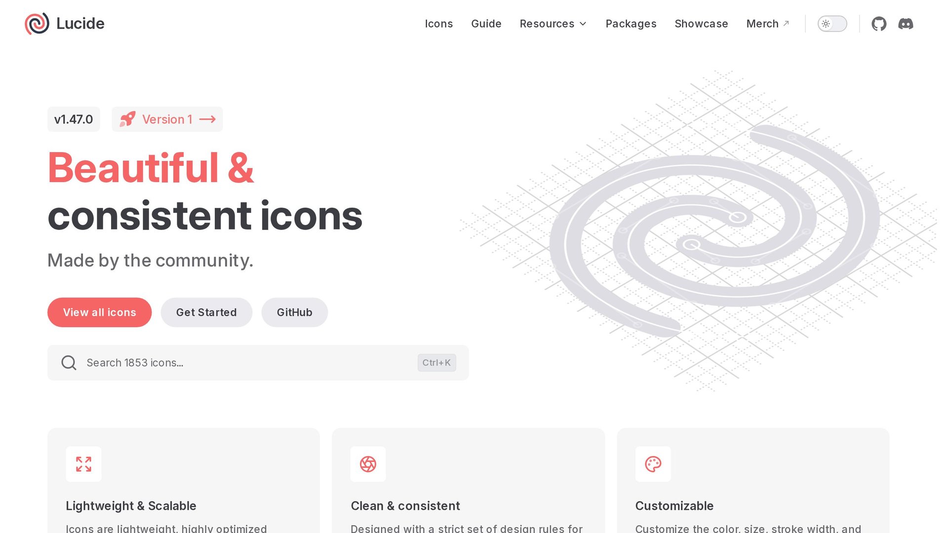
Lucide: a practical outline starting point
Lucide works well as a first candidate when you want icons to support an interface rather than dominate it. Its outline style makes it easy to build a restrained toolbar, settings panel, or dashboard.
The official React guide documents the lucide-react package and tree-shakable components. Import the icons you use explicitly, then share size and stroke settings across the application.
Choose it when a calm outline vocabulary suits the product. Before committing, check your awkward nouns: the industry-specific object, the unusual workflow action, and the status symbol that has no obvious metaphor. A family is only useful if it covers your actual interface.
One licensing detail deserves attention: the Lucide license file includes an ISC license and an MIT section for icons inherited from Feather. Keep the applicable notices with your distribution.
Heroicons: pay attention to the small-size sets
Heroicons is a strong candidate for interfaces that need both outline and solid symbols without introducing an unrelated visual language.
Its most useful distinction is not merely that SVG scales. The official repository documents separate React imports for 24/outline, 24/solid, 20/solid, and 16/solid under @heroicons/react.
That distinction matters in dense navigation and compact controls. Compare the purpose-built 16px solid option with a larger icon scaled down. Check whether fine details remain clear at the smaller display size.
Choose Heroicons when your interface mixes outline and solid needs across multiple sizes. The separate import paths exist for a reason: they prevent you from shipping one visual weight and calling it close enough.
Tabler Icons: breadth over perfection
Tabler Icons has a broad catalog, which makes it a good reference when your feature set is long. You will likely find an icon for every noun on your list.
Catalog breadth does not settle visual fit. Compare the specific Tabler icons you plan to use together at the same size and stroke settings.
Choose Tabler if its icons cover your interface and fit your design. Adjust individual assets only when your project needs it; this is a design choice, not a demonstrated library defect.
Phosphor: six weights for different personalities
Phosphor exposes six weight/style values: thin, light, regular, bold, fill, and duotone. Its React documentation lists the accepted values and server-side usage.
Set a shared weight across your interface before mixing icons. Switching weights mid-layout creates unintentional hierarchy. The library also documents a server-side import for React, which helps with SSR setups.
Choose Phosphor when weight is part of your design language, not just an accent.
Bootstrap Icons: straightforward web integration
Bootstrap Icons provides SVG files and sprites with no build-step assumptions. You can grab individual files or use the sprite bundle for simple web integration.
Bootstrap Icons uses a 16px design grid. Compare the actual icons at your intended CSS size and alongside your controls; the grid alone does not establish that they look smaller.
Choose the delivery format rather than defaulting to an icon font. A shared SVG sprite can reduce requests compared with loading each icon as a separate image file; inline SVG already avoids those image requests.
Two specialist resources
Simple Icons: brand marks only
Simple Icons provides brand SVGs and associated source, color, and guideline metadata where available. Its repository is CC0, but that does not waive third-party trademark or other brand rights.
Individual icon rights and brand guidelines still apply. Do not treat Simple Icons as a free-to-use badge for every brand. Check the usage rules for the specific icon, especially on merchandise or commercial products.
Iconify: one API, many collections
Iconify lets you find and consume icons across dozens of collections through a single API. It is convenient when you need a niche icon that no single family covers.
Keep in mind it is not one visual family with one universal license. Each collection has its own license and attribution requirements. Always scroll to the collection page before shipping in production.
How to choose without collecting every icon
The mistake most teams make is picking libraries for features instead of fit. Here is how to narrow it down:
Start with one family for 80% of your interface. Lucide for outline, Heroicons for solid, or Phosphor when weight matters.
Add a second family only for the 20% your first choice cannot cover. Use Simple Icons for brand marks, Tabler when you need catalog breadth.
Verify the license applies to your use case. ISC and MIT are permissive. SVG-based brand icons still carry brand guidelines.
Test the real icons together, not the preview grid. Import the 10 to 15 icons you will actually ship and check them side by side.
Pin the version. Icon libraries update frequently, and a single icon change can break your visual rhythm.
FAQ
Do I need to import every icon from a library?
Use explicit imports when your chosen package supports tree-shaking. For example, import { Search, Settings } from 'lucide-react' uses named imports; bundler optimization can exclude unused icons. Raw SVGs, sprites, icon fonts and runtime API delivery work differently—inspect the production bundle.
Can I mix two icon libraries in one project?
You can, but it shows. Mixing Lucide outlines with Heroicons solids creates a visual split. If you must mix, limit it to one accent library and keep the base family consistent.
Are these truly free for commercial use?
Lucide, Heroicons, Tabler, Phosphor, and Bootstrap Icons are all permissively licensed (ISC or MIT). Simple Icons is distributed under CC0, with separate third-party brand rights and guidelines to check. Iconify depends on the collection license.
How do I handle icon sizing?
Set a shared size token in your design system. Icons should align to your baseline grid. A 24px-grid icon displayed at 16px may be harder to distinguish; compare it with a purpose-built 16px icon. Pick one canonical size per role (action icon, decoration, nav) and stick to it.
Key Takeaways
Pick one coherent family for your base UI — Lucide, Heroicons, or Phosphor.
Add a second library only when your first choice cannot cover a niche.
SVG scales but weight matters more than size for visual consistency.
Test the actual 10–15 icons you will ship, not the preview grid.
Pin versions and verify licenses before production.
Linh Nguyen
Graphic Designer
Passionate Graphic Designer | Specializing in Illustration Design | Bringing Captivating Visuals to Life